April 2020
Connecting Buyers and Sellers
Tradable is a mobile application that provides college students with a quick, convenient, and easy way to buy and sell used or new textbooks and supplies. It helps alleviate some of the stress that comes with purchasing one-time use course materials. It also provides a space for students to find what they need all in one organized place.
tradable-banner
Constraints
4 - 6 hours
Max of 5 screens
Use Figma
Tools
✒️
Figma
Team
👫
Myself
My Role
👩🏻
Researcher
UI/UX Designer
The Story
Design Interactive is UC Davis’ first student-run human-centered design consultancy operating at the intersection of psychology, technology, and problem-solving. We use our diverse skills in social sciences research, prototyping, and visual design to help solve pressing challenges for businesses and nonprofits.

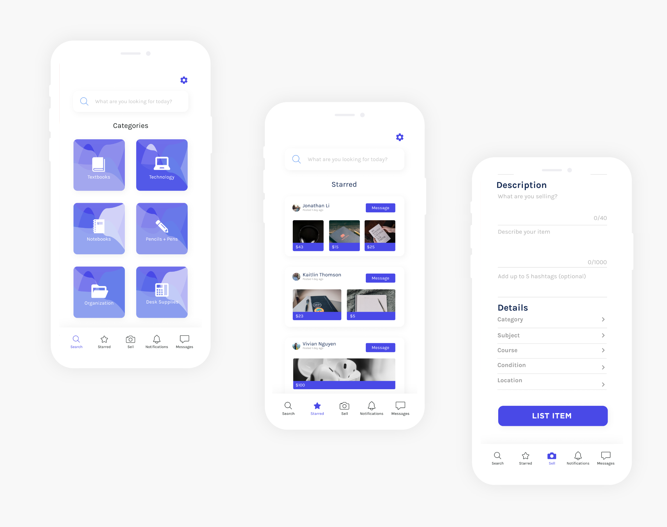
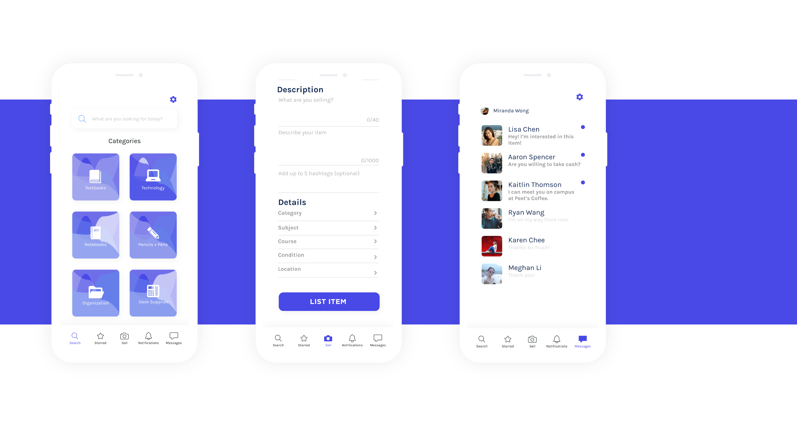
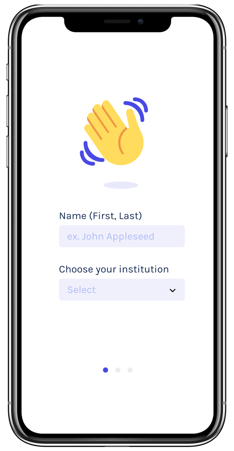
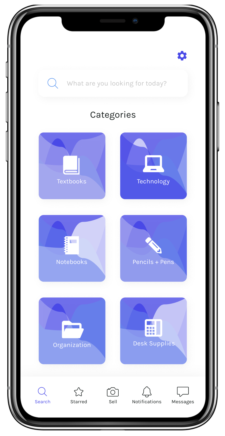
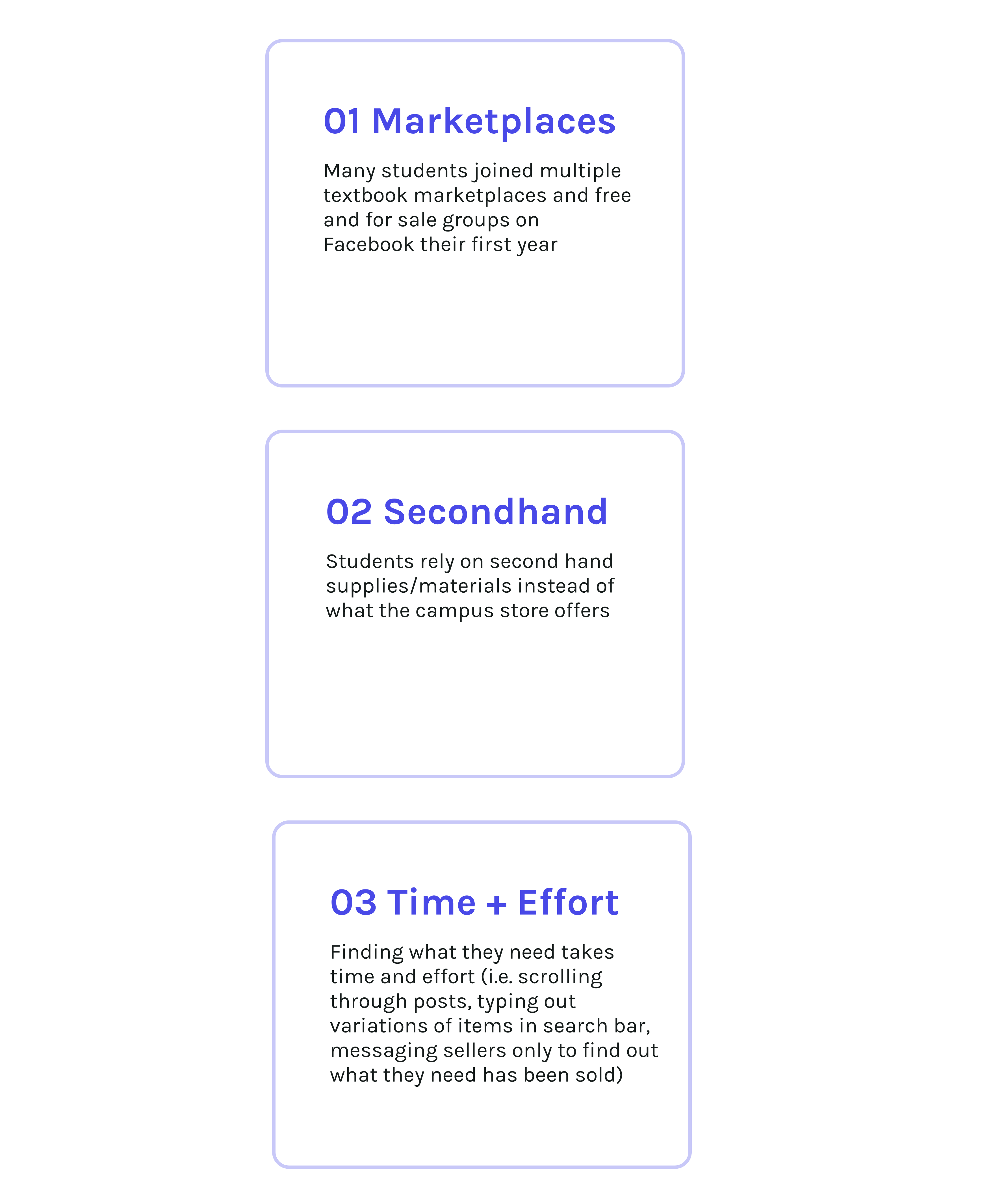
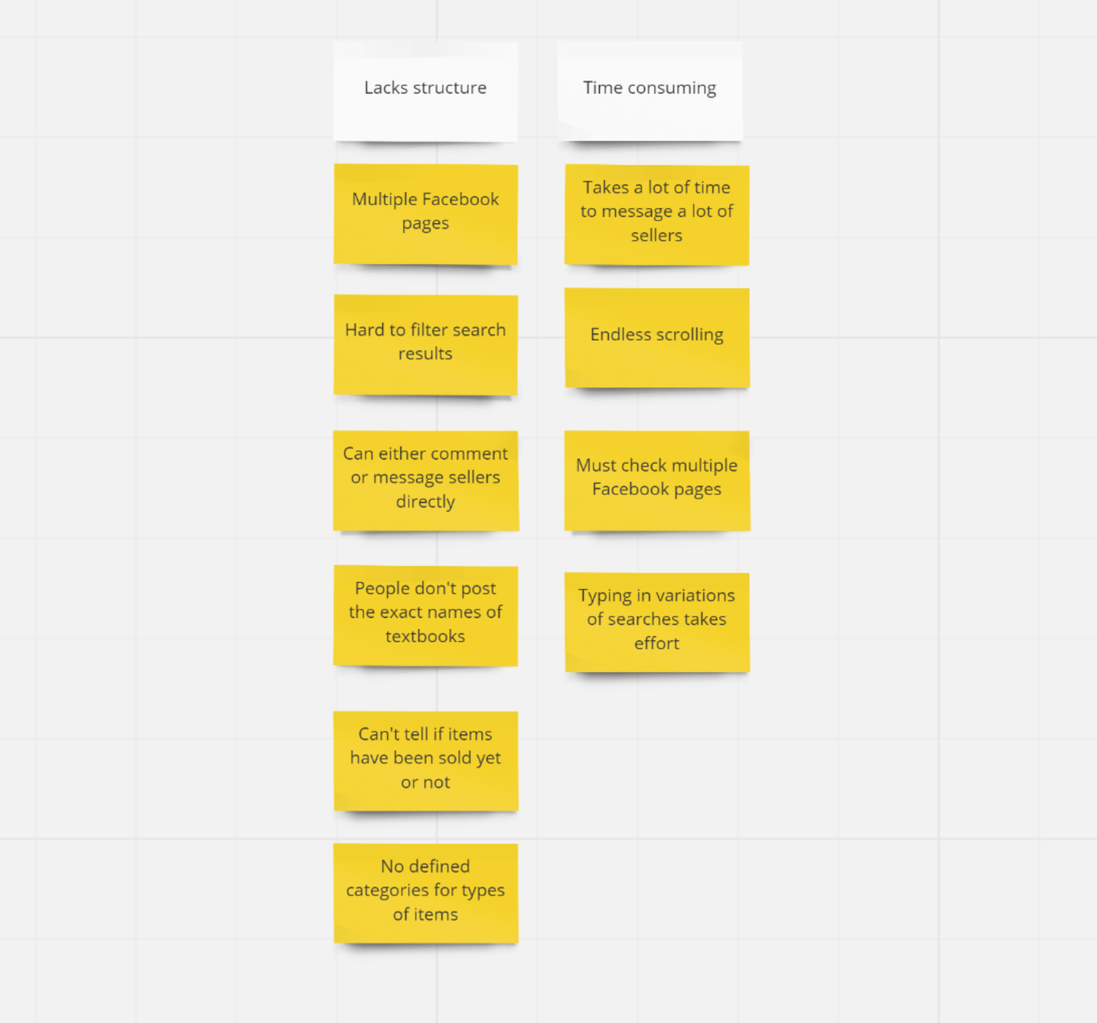
The design challenge:

Prospective applicants were tasked to identify a particular problem or a pain point that college students may have during their transition into college and design a solution on how we would improve this experience.

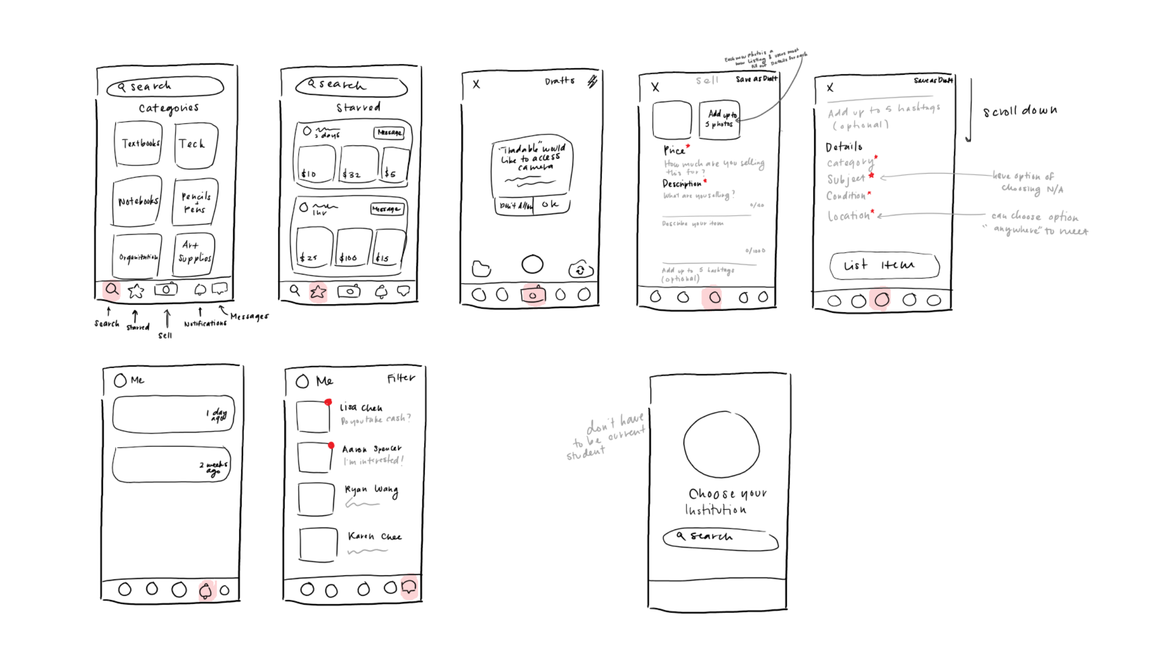
My Role:

I researched the problem space and spoke to stakeholders through direct interviews and designed and prototyped the final product concept.
Problem Space
What is the problem and what is the existing experience like?
Students often encounter many challenges transitioning into college. One of the most common challenges is dealing with financial burdens. With tuition and living costs, students refrain from buying non-essential items, however, it is common for professors to require extremely expensive textbooks and supplies for their classes. And accordingly, students turn to online textbook/supply marketplaces. Although this is a great place for students to buy and sell at affordable prices, it is hassle and frustrating to find what they’re looking for conveniently and quickly, sometimes leaving them with only one option: to buy new and expensive materials from the campus store.
Space for opportunity
What if we unite the physical and existing online experience into a single platform?
The Solution
I designed a new system for new and returning students that resolves the issues that come with the physical and online experience of buying and selling academic materials. I included the necessary elements for straightforward experience such as an in-app messaging feature, sorted categories and precise descriptions, notifications of sold items, and starred items.
Tradable solution banner
Let's break it down.
sign in page
Sign In Through Your Institution
After opening the app, new users are prompted to create an account by entering their personal information as well as the institution they attend. Signing in through their institution ensures each student is verified and a trustworthy buyer and seller. It also avoids an overpopulation of irrelevant students, meaning students that don't even attend their institution.
Search by Category
Instead of scrolling through many different posts, users can now simply search by the category they want. This will ensure that students will only see relevant items to further narrow down their search.
search by category page
starred feature page
Starred Items
Users can keep track of items that may want to buy using the Starred feature. This eliminates the need to take screenshots of items to remember them and/or try to search it up the next time they want to check its status.
Precise Item Details
The “Sell” feature requires sellers to use more specific details and naming conventions for their items.. Thus, users can filter search results more easily because items are organized based on category, subject, course, etc.
selling page gif
Tradable img break
notifications feature page
This Item's Been Sold!
In the Notifications feature, users are alerted when items they’ve “starred” have been sold. This eliminates the time users would normally take to keep checking the status of an item.
Direct Messaging
Users can message a seller or buyer directly without the hassle of using a separate app (i.e. FB messenger). This also eliminates the need for users to comment on items to alert the seller that they’ve messaged them or are interested in buying.
direct messaging feature page
Tradable img break2
How did we get there?
Behind the Scenes
Consulting stakeholders
To eliminate any biases or assumptions, I needed to speak with those directly involved in the problem and understand the context of the problem.
interview responses
What is your current experience like?
My first approach was to interview three college students to understand their needs and pain points in buying and selling school supplies. My main interest was finding out:

What frustrations and challenges do they encounter?
Why doesn’t the current system meet their needs?
What's the core of the problem?
Based on the responses I got about the current system in place, I wrote down key words that were mentioned and organized them into two specific categories to determine the general scope of this project and possible features I would need to include.

This revealed that the search for supplies and materials is complicated and time consuming on online marketplaces and there is no single place to look for supplies and materials.
affinity mapping results
Putting ideas together
Now let's give our insights a unified voice and define a tangible set of needs.
persona 1 persona 2
So who's really involved??
Based on the pain points I identified from the user interviews and affinity map, I created two user archetypes, the first year and the third year transfer student. They helped me keep the users in mind in this design process.

Through this, I identified the main characteristics and needs of my audience that I wanted to reflect in my final design.

1. Budget Friendly
2. Consistent Usability
3. Effective Time Management
How can we translate needs into tangible features?
Before commiting to the final solution, I sketched different solutions and screens that focused on the key pain points. I wanted to focus on creating the most efficient and user-friendly system.
inital sketches
lo-fi wireframes
Adding some structure...
From these sketches, I was able to translate them into simple wireframes. I was mainly concerned with creating different card layouts that best displayed the information.
The Final Product!
Within the last hour of this design challenge, I was able to see the concept come to life!
tradable final prototype
Reflection
Time sure does fly by!
Working within constraints
With the time limit, I wasn't able to get as deep as I wanted to in the problem space or prototype my designs fully. However, it was definitely a learning experience because I had to make do with the resources that I had while still putting out my best work. If time permitted or if I came back to this project, I would look into designing further into the search filtering feature. I would want to add a more specific feature where users could toggle open a filter drop-down menu. In addition, I would want to look into how to allow users to post about what they’re looking to buy.
Designing an intuitive system
The most challenging part of this project was designing a system that made the most sense and was most intuitive to new users. Nonetheless, I enjoying having to explore many different ways of displaying the information and determining which features were the most important to creating a streamlined structure.