Fall 2020, Remote
Improving and extending the food sharing experience to the larger community
7 minute reading time
Project Details
My Role
UI/UX Designer, Food Surplus Sharing Experience
Team
Myself, Nadia Anees, Briana Omori, Alekhya Yallapragada
Duration
October - December 2020 (6 weeks)
Tools
Figma, Notion
Our Remote Process!
In addition to our design team syncs, we also met with Kim (Co-founder) and Minhee (Engineer) once a week over the course of 6 weeks to debrief on progress updates, inquire about technical limitations, and consistently align the vision with the design.
Overall, this was a very collaborative and smooth process. By the end of our 6 weeks, we shipped our designs off to FreeBites and Kim was extremely impressed with our work.
The engineering team is currently working on development for the January live app release.
Overview
What is FreeBites?
FreeBites is a community-based food sharing platform that leverages technology to reroute excess food to where it can be eaten instead of wasted. It makes it possible for folks to discover free food and share surplus food wherever they are and builds an inclusive, cooperative, and local food ecosystem among neighbors, local restaurants, and non-profits.
Why a redesign? 🔥
While there are a number of reasons FreeBites called for a redesign, the 2 main reasons are that the current design isn't optimized for all user types and FreeBites wants to shift from a campus-based platform to a community-focused one.

Below is a comparison between the FreeBites app before and after our redesign.
sending a message gif
solution preview mockup
UX Research Plan
As a group, we fleshed out our UX research plan, which included a competitive audit and user interviews with usability testing.
Our main research goals were to understand the food sharing process and identify the different types of users that might use the app and their pain points, goals, and needs.
Competitive Audit
We conducted a competitive audit to familiarize ourselves with the food sharing process.
We identified multiple ways in which these competitors provide a better user experience than FreeBites:
1. More customizability and control to users
2. Ability to see live food availability updates
3. Clear linking between pages
4. Connects people with free food opportunities quickly and efficiently
5. Builds higher credibility between food sharers and seekers
user research
A week of user interviews
We conducted a total of 6 interviews with active users, consisting of students, educators, and community leaders. Those interviews were broken down into 2 parts:
Part 1: Questions to learn about their current user flows and overall app experience
Part 2: Light usability test of the current design to observe how they find or post about food surplus in the current ecosystem
Our goal was to identify patterns and pain points in the current experience and discover how each user type can more efficiently and easily operate through their user flows.
interviews
Classifying Users
We discovered FreeBites' 3 main user types:
1. Food insecure (surplus seeker)
2. Food secure (surplus sharer)
3. Non-profit
What we heard
"I love Freebites. I wish I was using it more. I wish I was on campus more."
— Student, Surplus Seeker
"The app can feel limiting, one photo could not provide an accurate visual of what was available."
— Community Leader, Surplus Sharer
"I felt bad when students came too late and the food was no longer there."
— Community Leader, Surplus Sharer
"I want to give people a set time for when food distribution begins."
— Community Leader, Non-profit
Research Synthesis
We collected a lot of data on our 3 user types and needed to streamline our findings and prioritize the main focus areas that aligned with our overall research goals.
Empathy Mapping
To highlight key research findings across all user types and aid in our decision-making, we utilized empathy mapping. This helped us make inferences about our users based on their behavior, prioritize where our focus laid, and determine what the most important takeaways were.
empathy map image
Top takeaways
While each user type had a variety of needs and pain points, across all user types, it was clear to us that the most important takeaways were:
1. Users only find themselves using the app on campus
2. Expectations are disconnected between each user type
3. Limited customizability and autonomy keeps people from engaging with the app
Illustrating experiences
We each diverged and created our own storyboards to visualize the full weight of the issues and present potential solutions that might solve them.
Storyboarding
In the storyboard I created, the task flow illustrates the interaction between surplus sharers and surplus seekers: from how a surplus sharer decides to post on FreeBites and what they must do to post successfully to when the seekers arrive with different expectations.
storyboards
Top Solutions
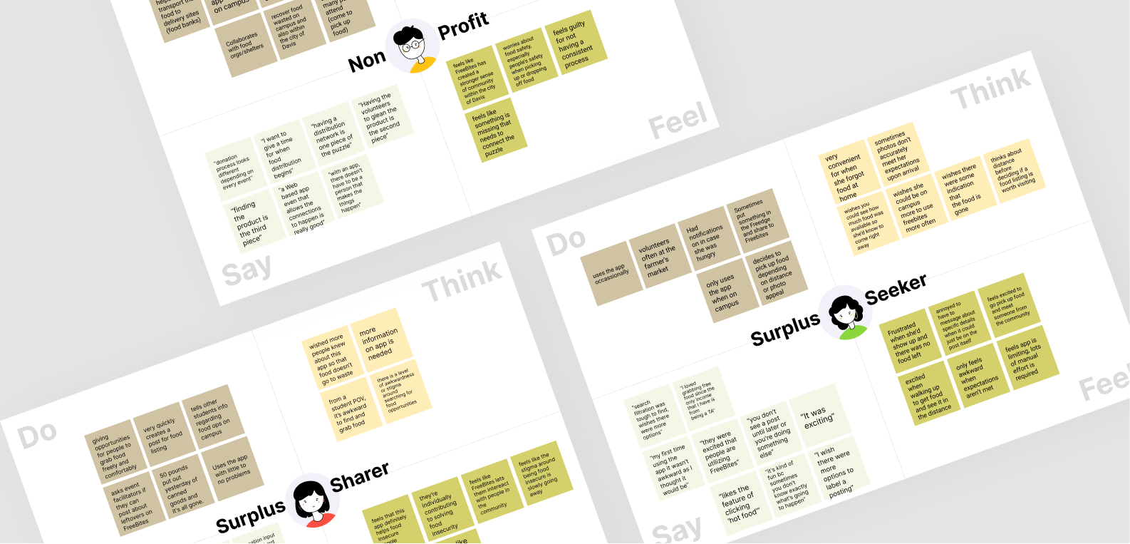
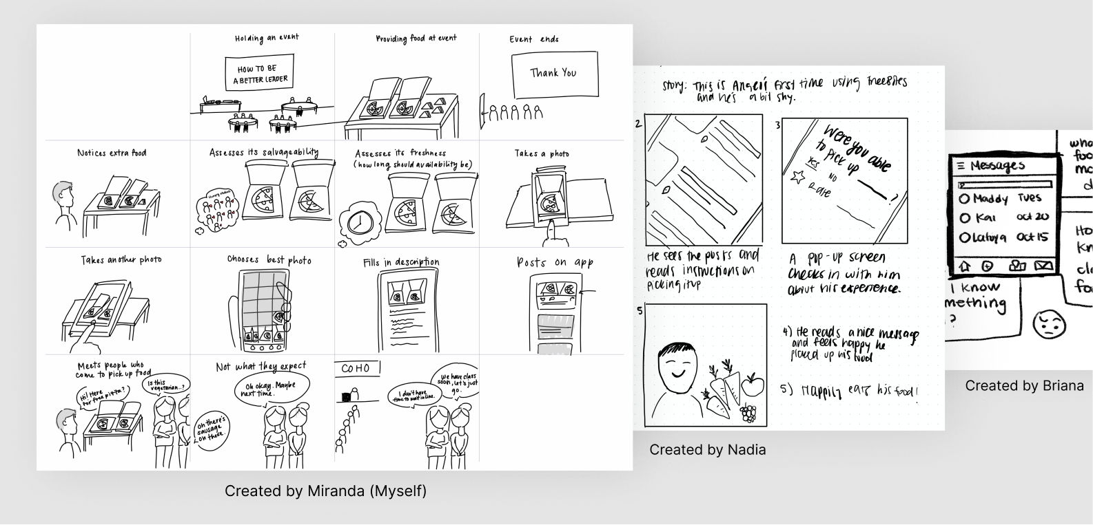
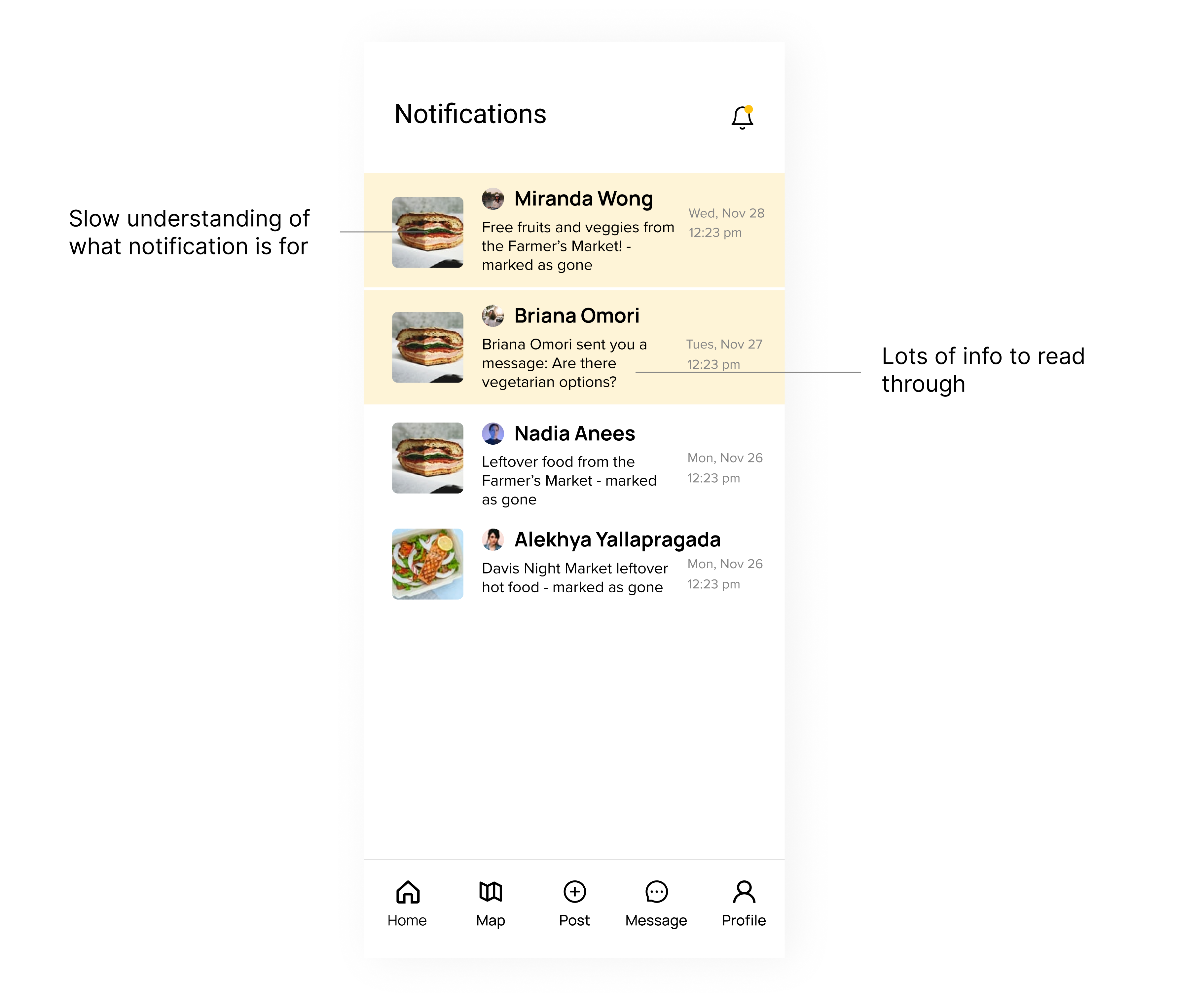
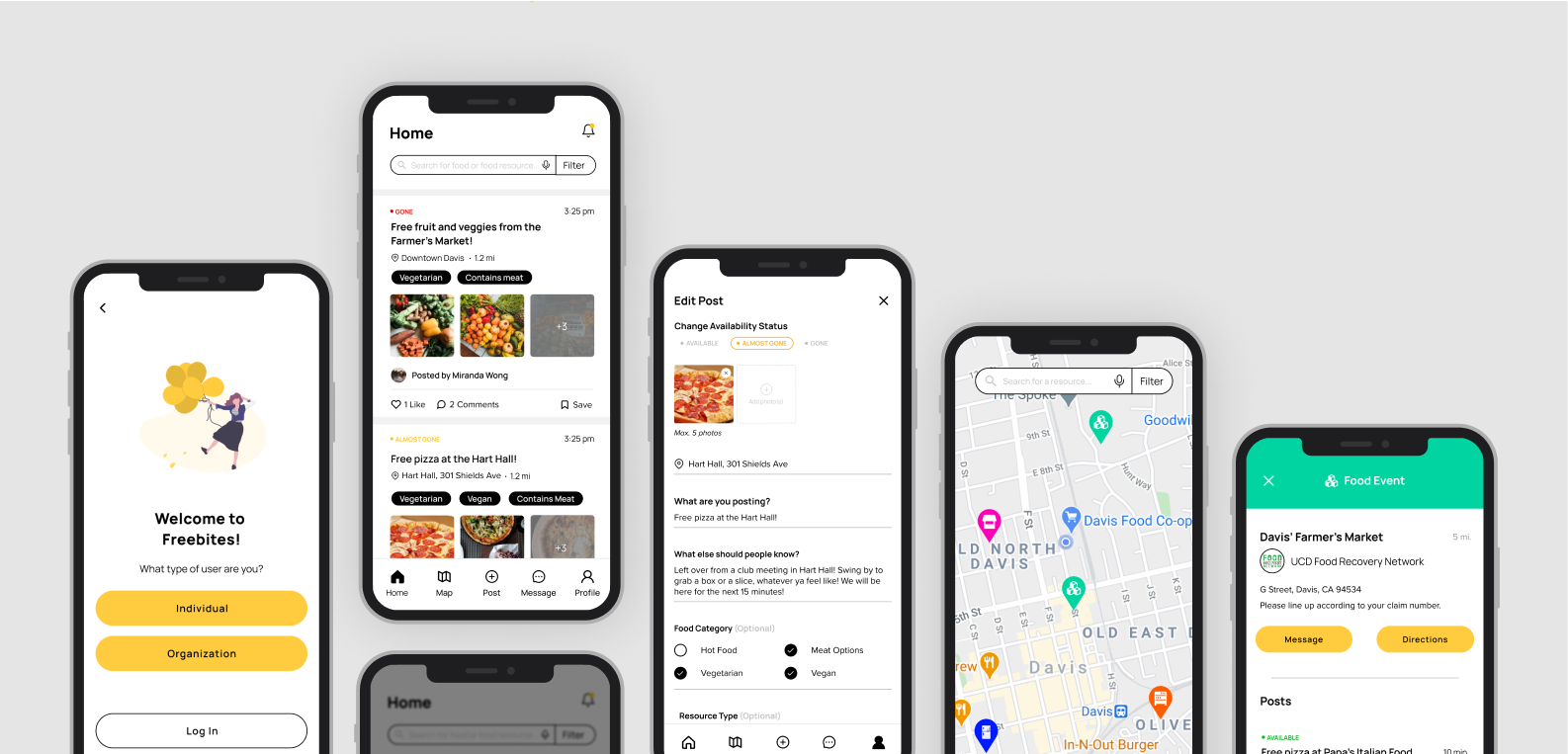
Storyboarding revealed that the main issues with the current experience were misaligned expectations and limited customizability/autonomy for all user types. At this stage, we were able to establish our top solutions for our redesign that would remedy these issues:
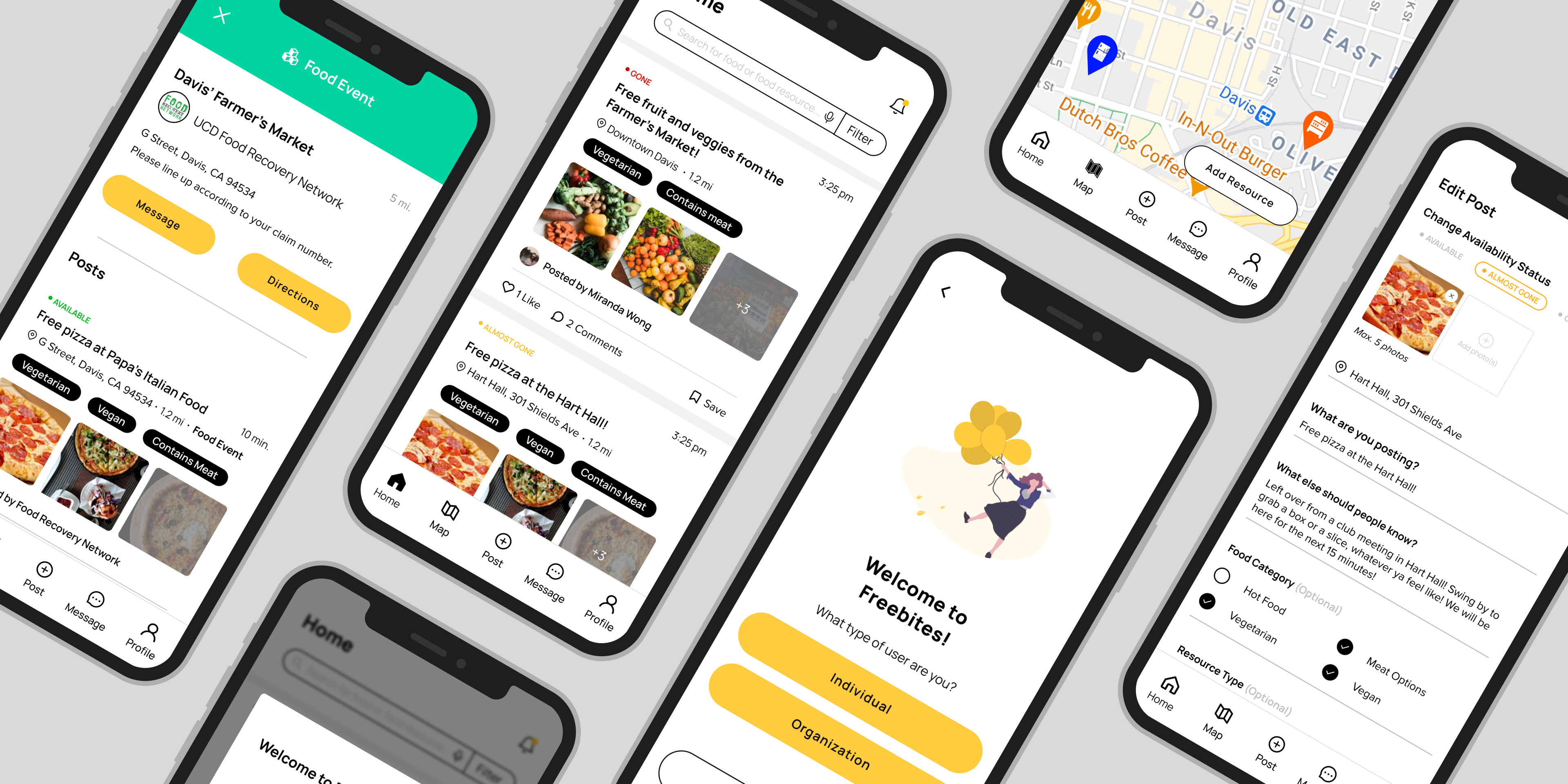
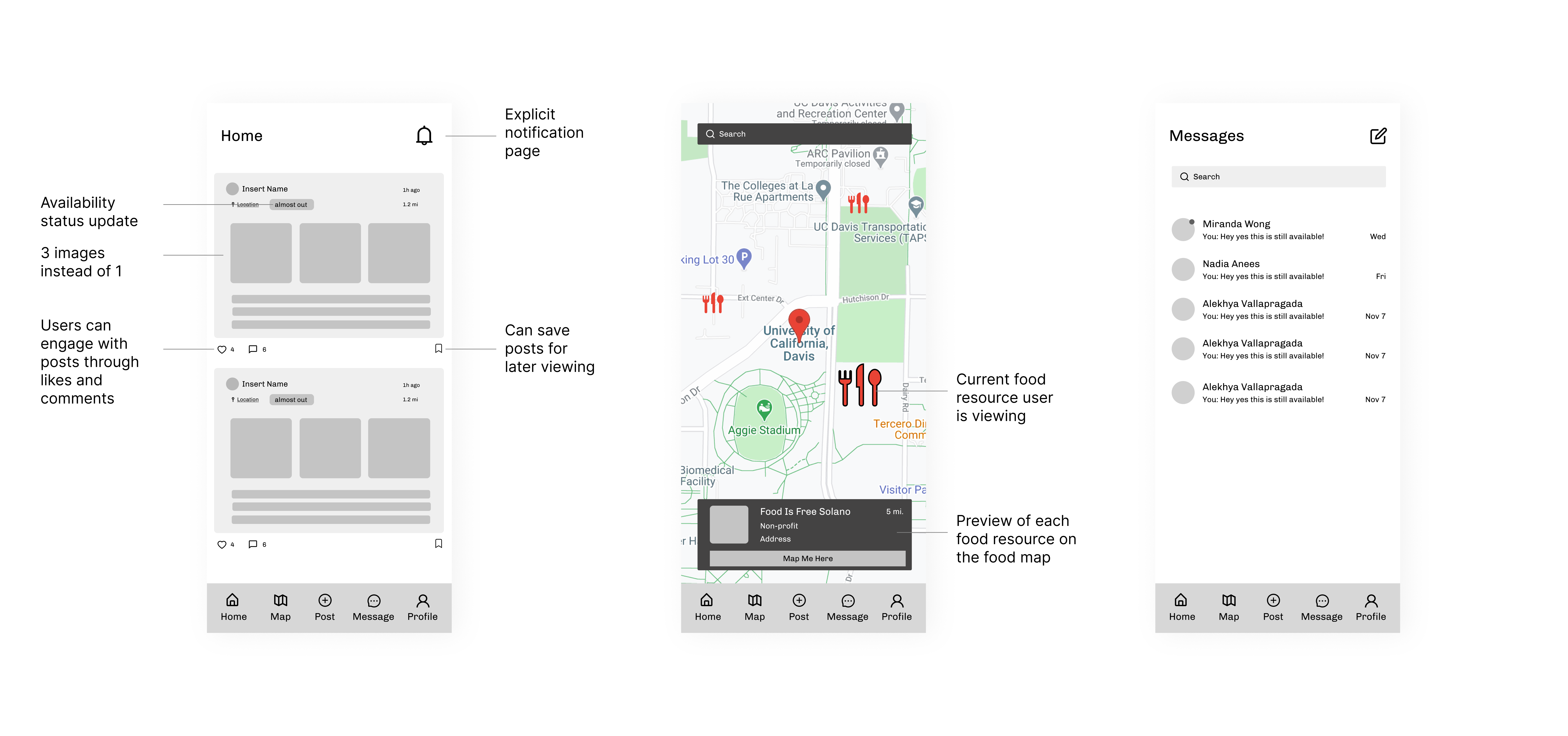
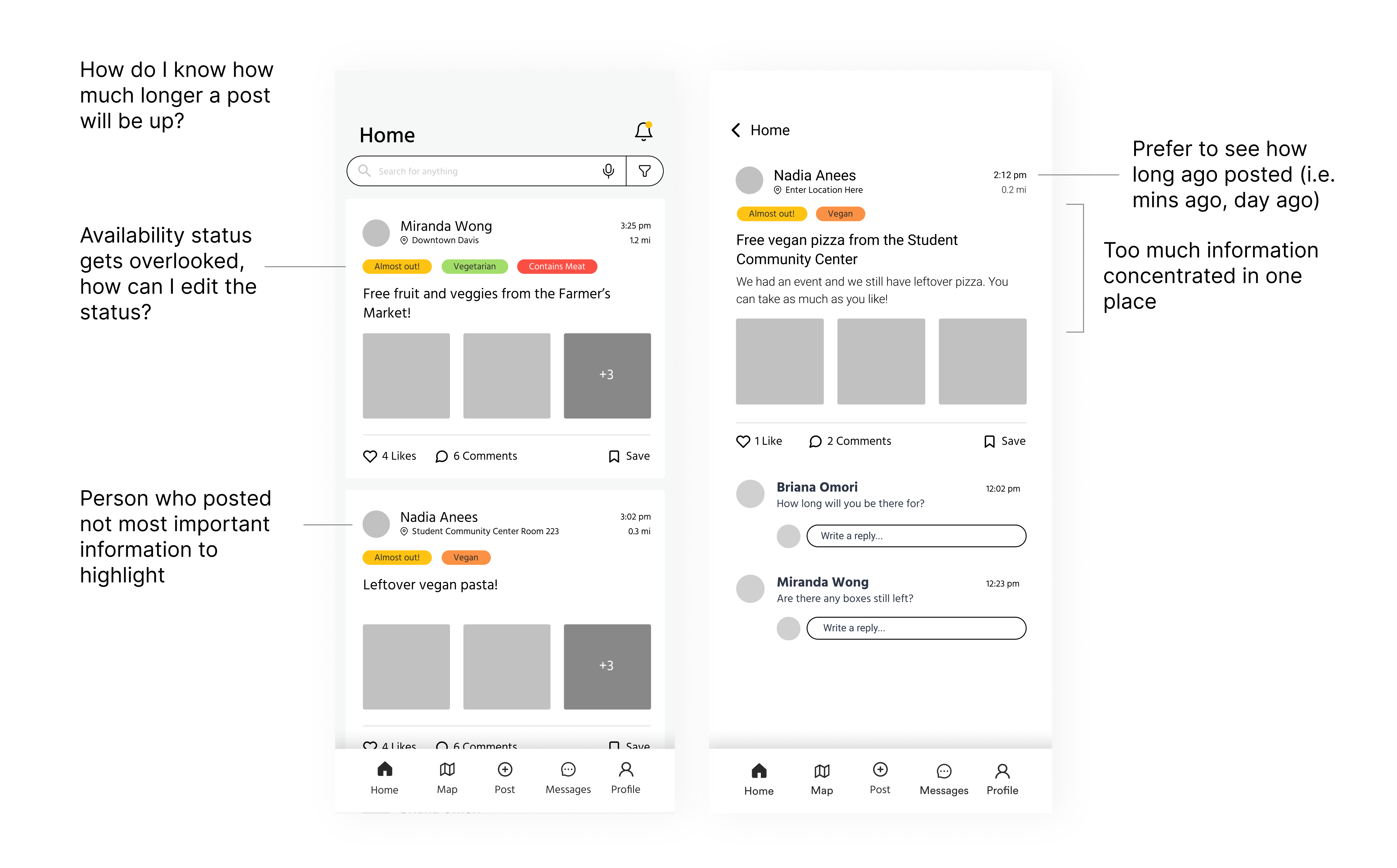
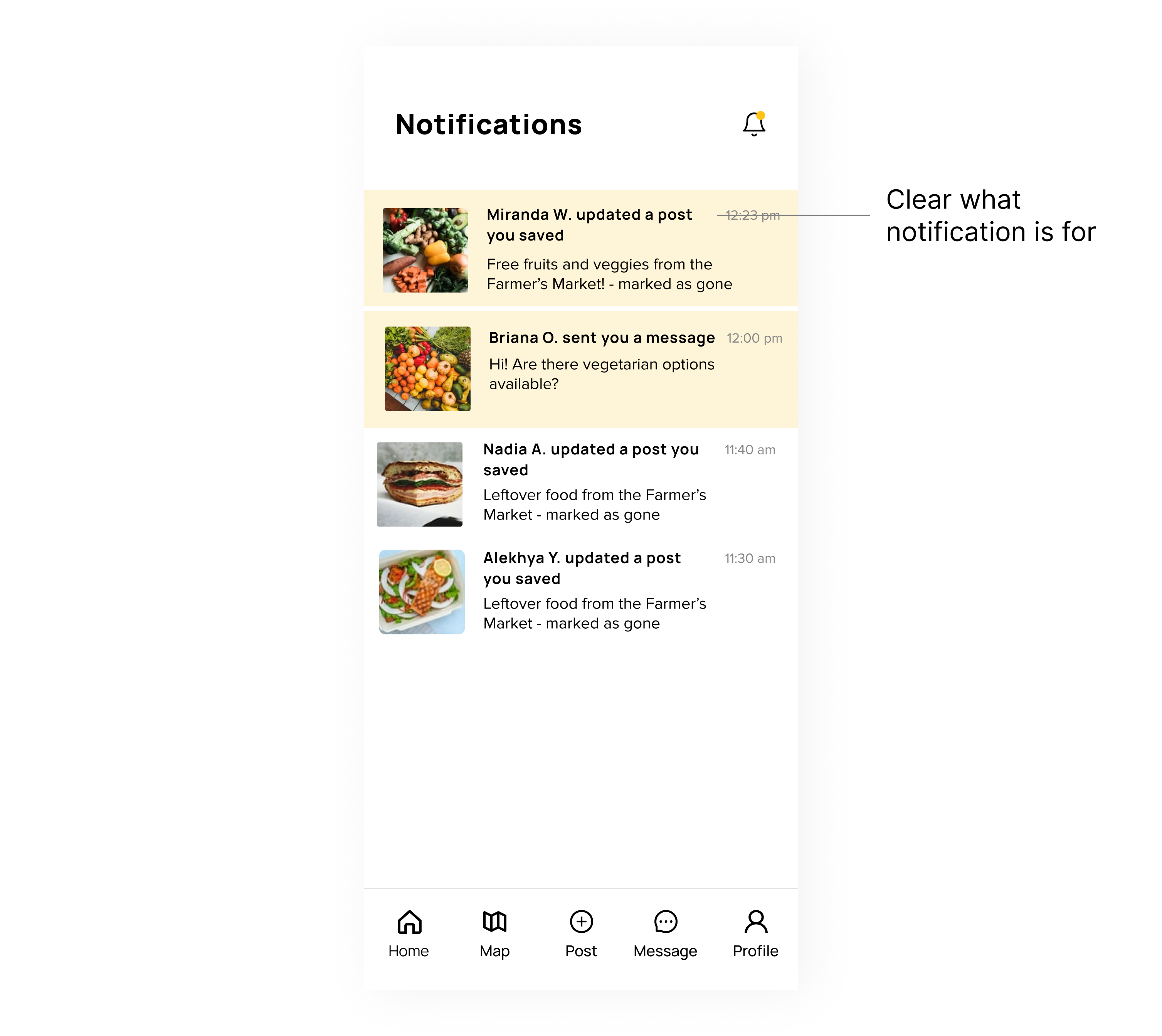
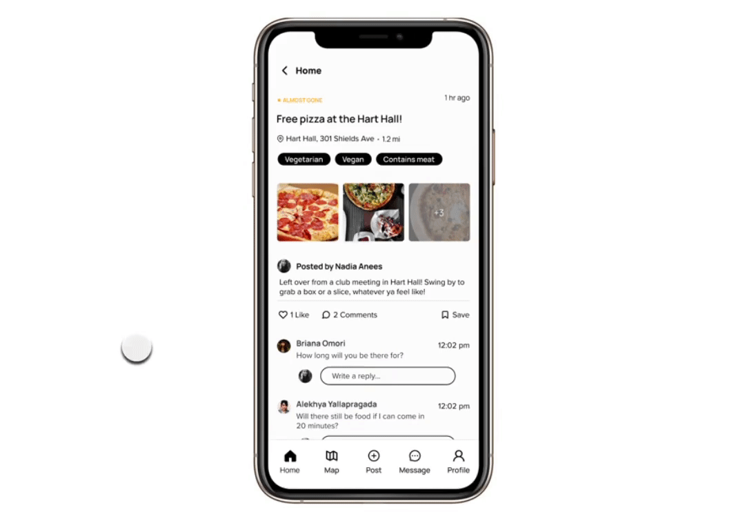
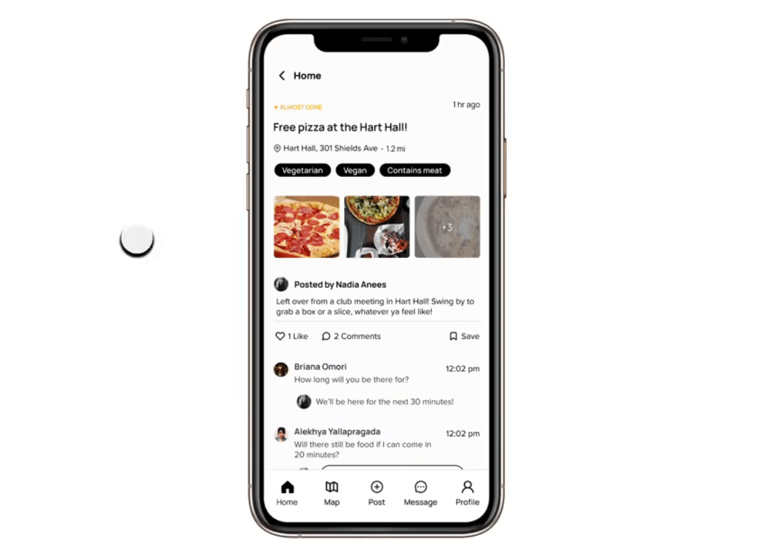
Real-time updates
Allowing surplus sharers to assign and change the food availability status on their post and notifying seekers of updates would help align expectations between them.
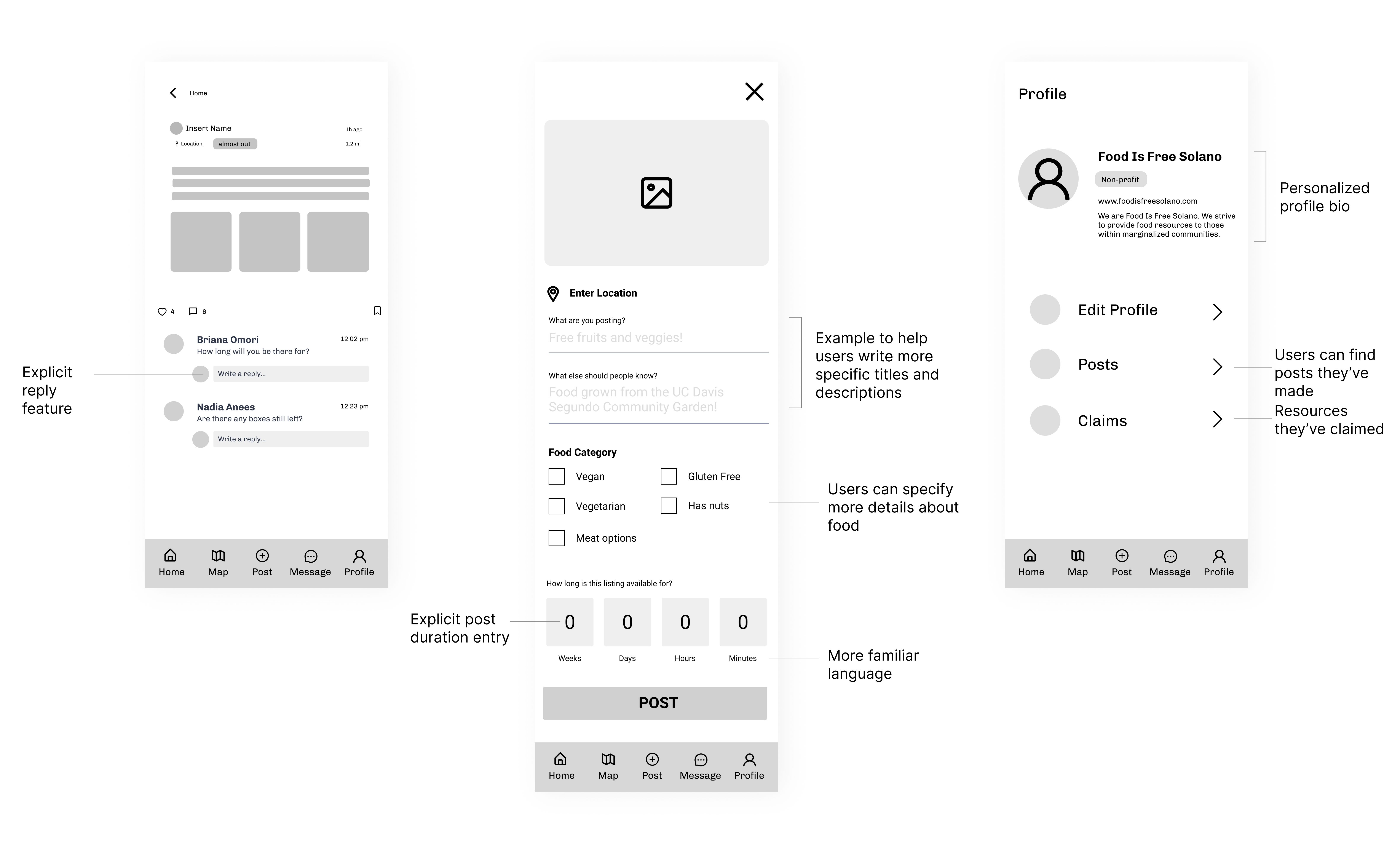
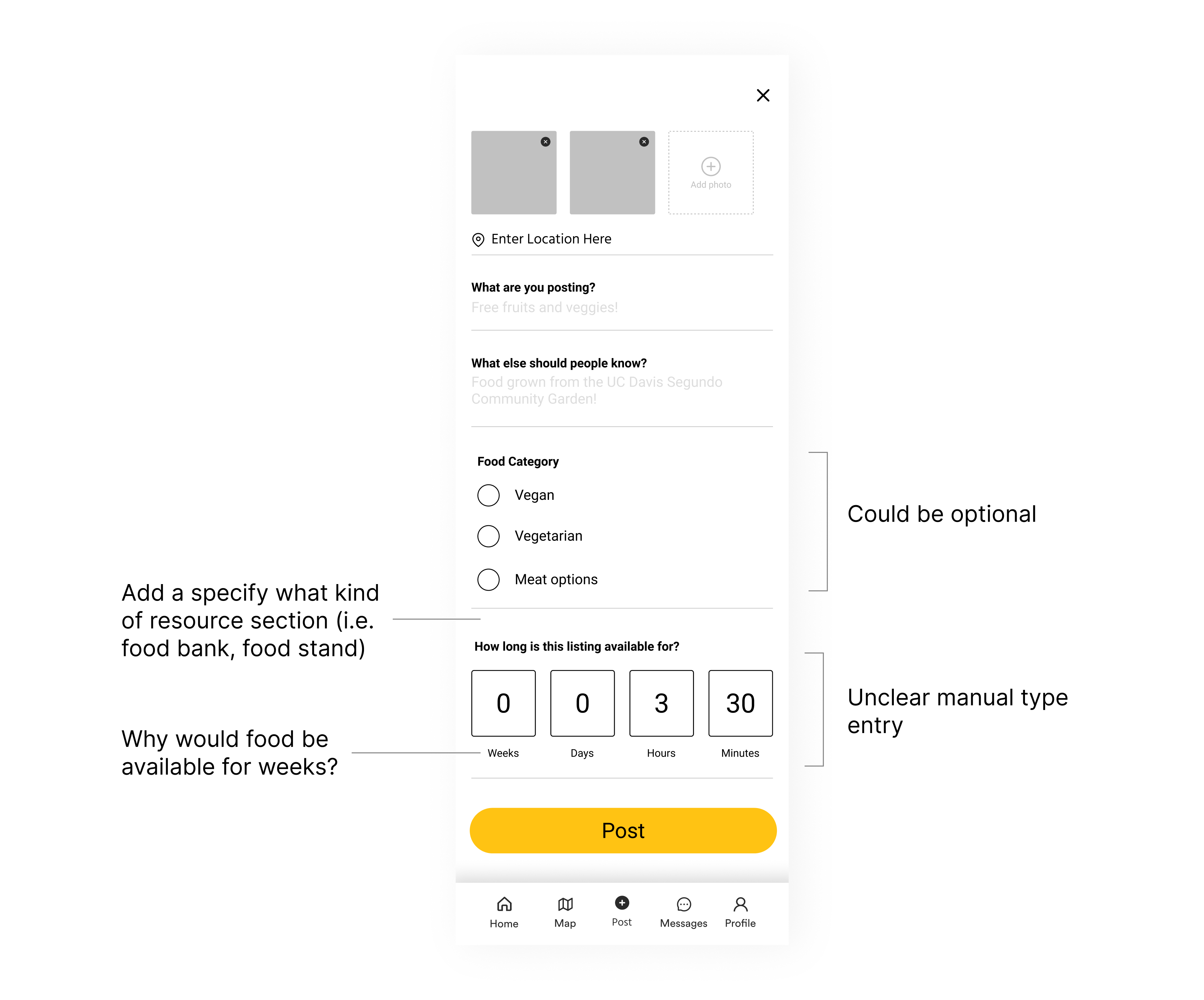
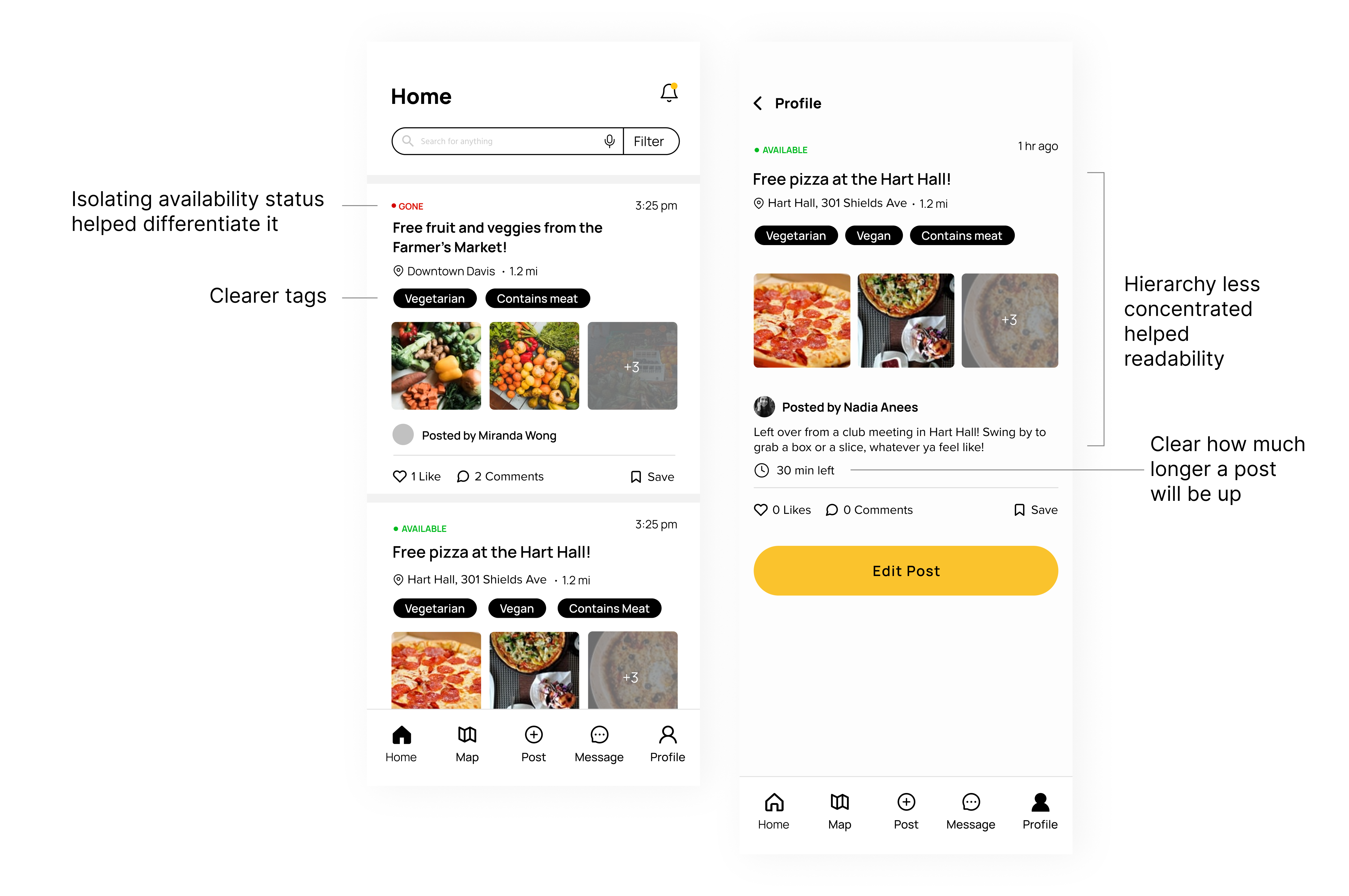
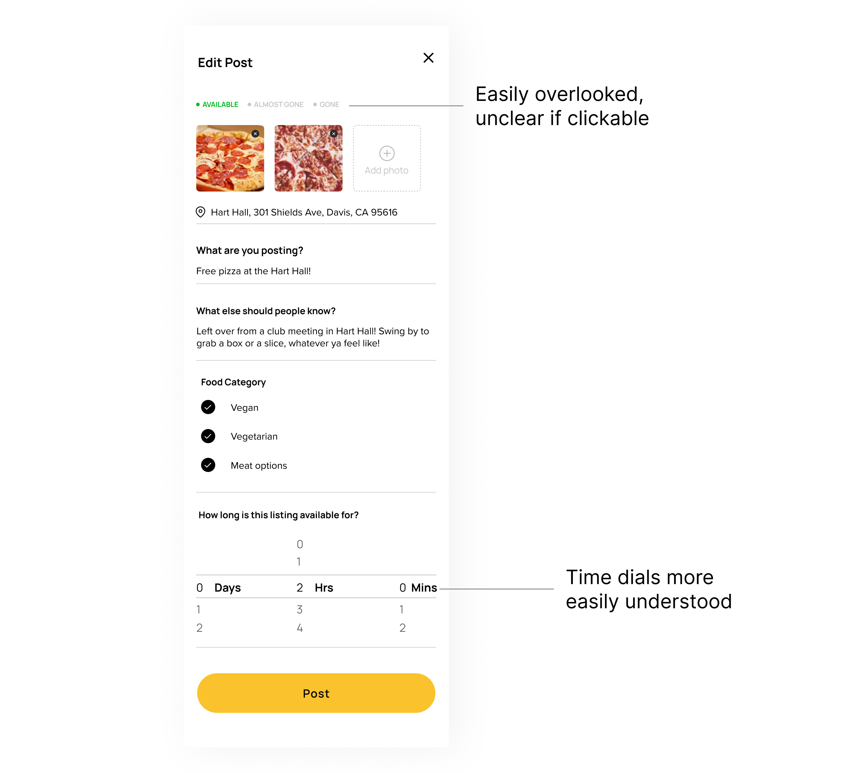
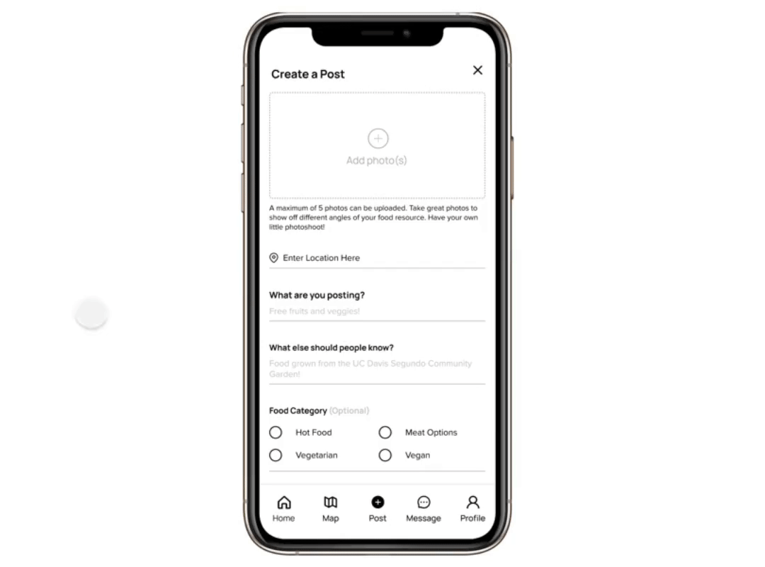
Post customization
Adding more options to allow for post customization would minimize frustration, anxiety, and confusion during food acquisition. It would also present more accurate search results.
Non-profit experience optimization
Building out a more comprehensive food map based on resource type would optimize the non-profit experience to increase their engagement. Because non-profits are more connected to members of the community, their engagement would expand FreeBites' community usage beyond campus.
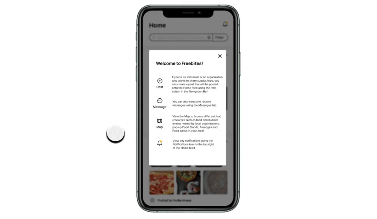
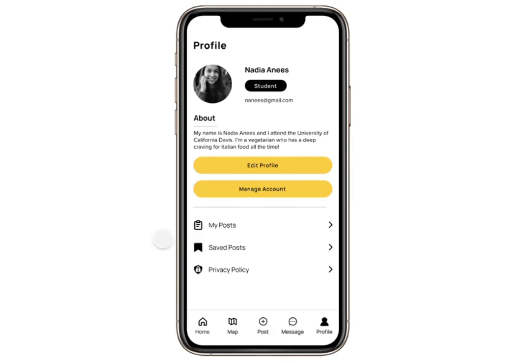
Social media model
Modeling our design layout and iconography after social media platforms like Instagram and Facebook, further asserts that sense of community that FreeBites is aiming for. Adding in a liking feature, comments section, and profile acts as encouragement and proof to other users that people in their community are also engaging with the app.
Low-fidelity concepts
We split up to create our own low-fidelity concepts to generate as many unique ideas as possible and disregarded constraints to explore the most creative solutions.
We also used this as an opportunity to visualize and decide on the most efficient user flows.
low-fidelity mockup 1
low-fidelity mockup 2
UI refinement
We presented our low-fidelity concepts in our first design review with our client and were able to confirm development feasibility and approval of each of our solutions.
Building a moodboard
We put together a moodboard for inspiration before creating our own design system.
moodboards
Establishing a design system
Once we felt we were in agreement with the visual feel, we decided on a design system to ensure consistency across all screens and ease the development process.
design system
Part 1: Gathering feedback
As a team we polished up the screens that would be used in user testing and established our main user testing goals.
Questions to answer
1. How effortless is it to complete tasks pertaining to each of the 3 user types?
2. How well does our assumed user flow align with our users' approach?
Because I worked on the designs and user flows from the perspective of a food secure person(surplus sharer), I will be highlighting the information pertaining to my individual contributions from here on out.
Home feed and individual post
feedback on home and post designs
Creating a post
feedback on post creation designs
Notifications
feedback on notifications designs
Part 2: Gathering feedback
After iterating on the feedback I gathered, I tested again to see if these changes improved usability.
Home feed
feedback on home feed and posts designs
Editing a post
feedback on editing post designs
Notifications
feedback on notifications designs
Final Designs
The demo gifs here demonstrate the features I designed and presented in our final handoff client meeting. Each feature below was driven by research, user stories, client feedback, and user testing.
Demos
Home feed
After opening the app, new users a presented with a pop-up identifying the main actions they can take on the app. Upon closure, they can view the home feed with listings made nearby or search and filter for a more specific food opportunity.
home feed gif
Reply to a comment
Users can quickly reply to a comment by typing into the pre-set "Write a reply" bubble.
replying to a comment gif
Create a post
Users can create a post and customize it to make for more accurate search results. We added many options to help avoid having users manually type in any specific details.
creating a post gif
Edit a post
Users can update the status of their food surplus by editing a post. Once it's been edited, food seekers that have saved the post will be notified of its availability status change.
editing a post gif
Send a message
Users can quickly message other users about food acquisition details or ask any questions.
sending a message gif
final designs
My learnings
There truly are no dumb questions
Naturally, I'm hesitant to ask questions, out of fear for it being a dumb one. However, throughout this process I've realized that that poses a huge blocker that really had no business being there in the first place. In the beginning of our design process, I felt like we didn't have enough information on who really uses the FreeBites app. Although we had a survey to reference, I didn't want to dive right into idea generation without a complete understanding of our users. I wanted to ask more questions to get at the heart of our problem space and use that as our north star. By asking questions during user interviews pertaining to how a user currently uses the app and what their goals are, it revealed that there were 3 different user types (something that wasn't obvious from the survey responses) and this key finding guided our entire problem-solving process. Because we wanted to create a holistic experience, it was so intergral to understand each user type and their difficulties. I'm realizing as I take on more and more projects, expecting myself to know everything is an unrealistic feat and asking questions can really only help me in the process.
Asking questions helped me deliver a product that considered all users and their unique set of needs and ultimately gave the end-user complete control over how they use the app to accomplish their goals. I am incredibly excited for these designs to be developed and it's rewarding to know that I've contributed to FreeBites' mission of alleviating food insecurity and cultivating a safe and giving community.