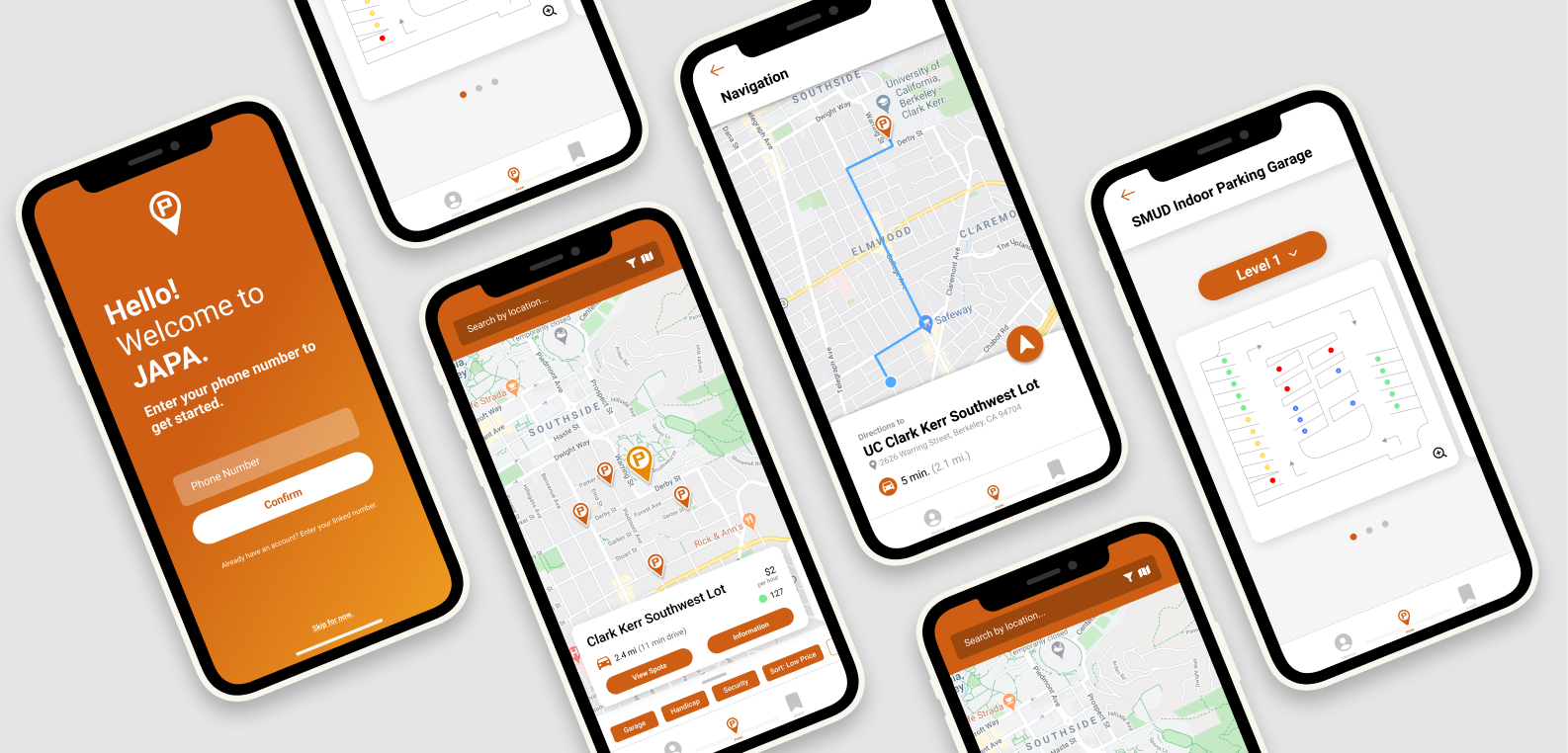
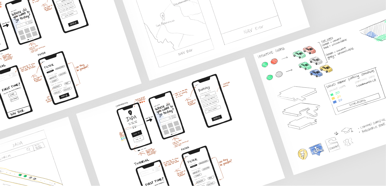
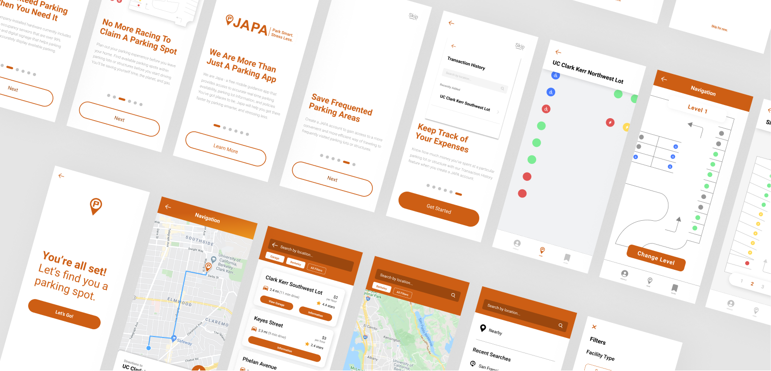
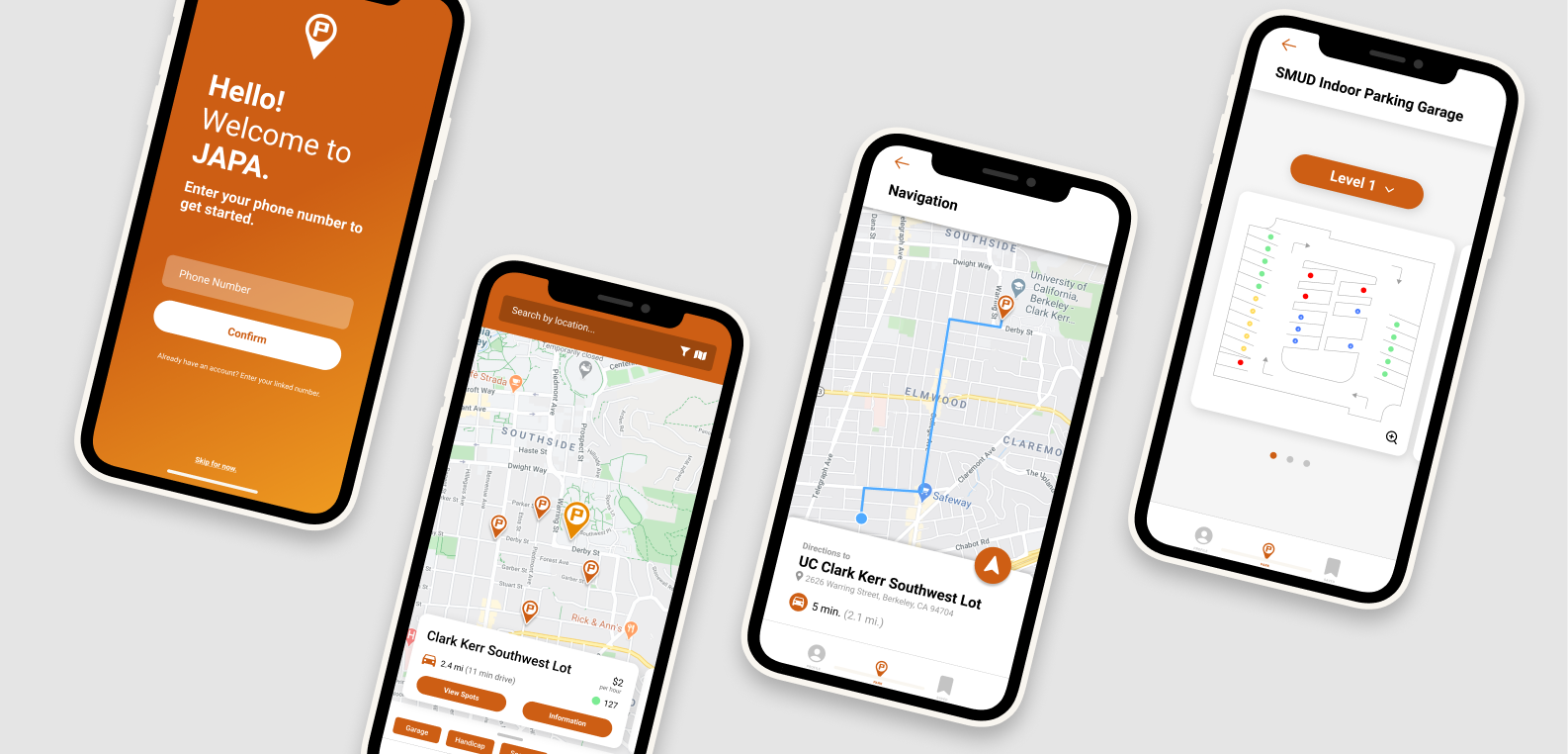
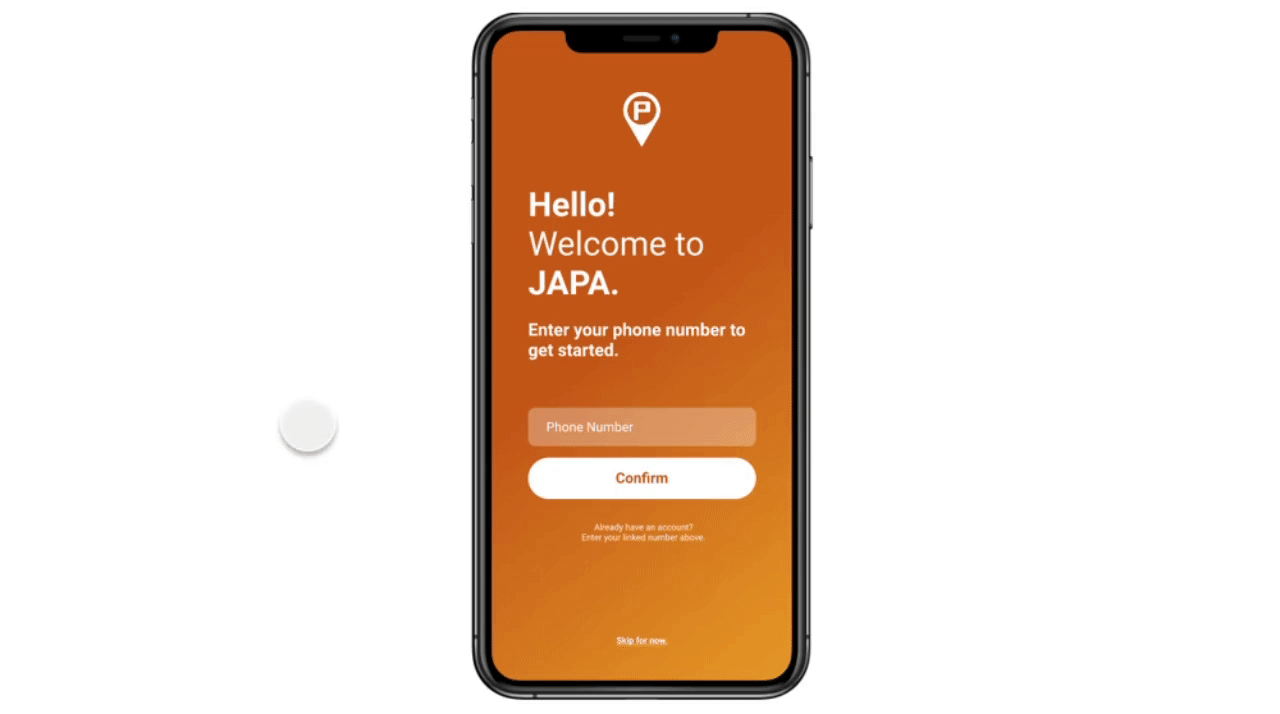
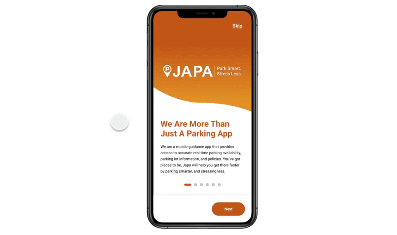
Spring 2020, Remote
Streamlining the parking experience + optimizing for scalability
JAPA, or Just A Parking App, is a free mobile guidance app for consumers that provides access to accurate real-time parking availability, parking lot information, and policies. The free app allows users to view spots ahead of time to plan out their parking experience before leaving the house.
8 minute reading time
Project Details
My Role
UI/UX Designer, Lo/Mid-fi Prototyping Lead, Parking Layout and Driver Safety Designer
Team
Myself, Briana Omori, Kiara Cowderoy, Edward Chew, Michelle Gore (Project Mentor)
Duration
May - June 2020 (6 weeks)
Tools
Figma, Notion, Google Sheets
Our Remote Process!
Throughout this process, our team met multiple times a week over Zoom to bounce ideas around and discuss the next steps in the project. We also met with JAPA’s CTO (Charles) weekly to present the week’s work and gather more information about JAPA’s vision for their app and any technical limitations.
By the end of this process, we presented our project to 100+ people, including industry professionals, students and junior designers, and friends and family. We placed 1st for the Audience Choice Award and User Research as well as runner-up for Most User-Centric and Visual Design.
Overview
The Challenge 🔥
While JAPA fills the need for a real-time guidance mobile app that provides users with hassle-free parking, a closer look revealed that it failed to address the complex, varying needs of their users and consider future scalability.

Below is a comparison between the JAPA app before and after our redesign.
original design
Solution Preview
We spent 6 weeks interviewing, researching, testing, and designing a comprehensive prototype that eases future feature integrations as well as takes new and returning users on a more controlled, directed, and personalized journey to get them smoothly to their destination.
new design
UX Research Plan
During the first week's UX research sprint, we decided that we needed to do some context setting to familiarize ourselves with the problem space. Our game plan consisted of performing an audit of the app's current state, examining JAPA's business goals, conducting a user task analysis, and evaluating competing platforms.
Auditing the current app
As a new user myself, I struggled to use the app with ease, unsure of where to start and what actions I could take on each page. During this audit, I also uncovered some of the broader issues, including slow loading times, a lack of direction — a user does not know what to do in the app — and a lack of meaningful visual design.
current app audit
current app audit 2
Exploration and Saturation
To understand our problem space, we immersed ourselves in JAPA's business goals and the market landscape.
Business to Human Questions
We translated company-centric goals and habits into customer-centric questions that would guide us to better empathize with and understand current and prospective customers.
This exercise helped us put ourselves in the users' shoes, while still considering JAPA as a business and its goals for operational and financial outcomes.
business to human questions
What's the current market landscape like?
To determine JAPA's current strengths and weaknesses, we analyzed their competitors in the market. I proposed we synthesize our data into a matrix to see any patterns or areas of weakness more easily.
Competitive Analysis
Through this evaluation, we were able to establish what made JAPA unique, what areas they're lacking in, and what features and strategies were working for their competition. We were also able to get a better understanding of the market landscape and determine where JAPA stands in it.
competitive analysis
Putting ideas together!
From our research, we determined that JAPA's target audience is people who frequent locations, meaning working adults and students. Meet Rebecca and Matt. These are the two archetypes that well represented our primary user groups.
persona 1
persona 2
Who are we designing for?
We identified the main characteristics and needs of our audience that we wanted to reflect in our app design.
1. Budget Friendly
2. Convenient and Consistent Usability
3. Safety + Comfort
4. Simple, Intuitive, and Accurate Navigation
5. Recognition for Customer Loyalty
6. Effective Time Management
The Road Most Traveled
(Yes, pun intended) This path is the ideal path a user should take, highlighting the the key steps that help the users find our app's real value.
By knowing our product's ideal path, we can focus our work and prioritize the central flow of the app.
golden path
Defining features
After synthesizing all of our research, we wrote out different “How Might We?” questions to identify issues in the app. We then organized these into categories to find the broader problem spaces to focus on, such as navigation or the parking layout feature.
how might we's to affinity mapping to voting
Not only did this help us identify the necessary features for the app, but also some questions served as goals for the whole project: maximizing visual appeal, making the app recognizable to users, and the focus on efficiency.
With the list of design issues in hand, we prioritized them based on the insights gained from our user research. We brainstormed answers for these questions, some drawn from our competitive analysis, and discussed and voted to select the ideas that could most effectively solve user problems.
Ideation and low-fidelity concepts
We took to the drawing board and threw some sketches together. We each brainstormed 2-4 sketches on our own and then reconvened to identify any overlapping ideas and discuss what direction and style we wanted the project to go in.
sketches
User testing
For each of our focus areas of the app, we all conducted usability testing and continued iterating until reaching the product's final forms.
I'll be focusing on what I did in this section. I built off the original app's bare bones structure and designed an interactive parking facility layout. After I went through several iterations of wireframes and mid-fidelity prototypes and incorporated feedback from the team, I prepared some high-fidelity prototypes for A/B and usability testing.
low to mid-fi iterations
Improving Upon Feedback
Session 1
session 1 feedback
Session 2
session 2 feedback
Session 3
session 3 feedback
Final Parking Layout Concept
Users expressed that the “Level 1” title was a button and tried to click it because we consistently used this pill shape throughout the rest of the app. We also noticed that most users didn’t try to click on the parking layout cards because there was nothing to indicate that it was clickable.
To improve upon these areas, we turned the “Level 1” title into a button that allowed users to hop in between levels more quickly and added a magnifying glass icon in the bottom right corner of each card to indicate that they could zoom in to see the level more closely.
final garage concept
A/B Testing
To find out what was more easily understood by our users, we conducted A/B testing. In our initial designs, we had used a muted red color to indicate an unavailable parking spot and an “R” symbol to indicate a parking spot with special restrictions.
We changed the red parking spot icon color to a more vibrant and bold red, which more quickly identified as an occupied space. To help our users understand its actual meaning, we replaced the "R" with a star icon and added an explanation of what the star meant to clarify its meaning even further.
a/b testing
Our final product!
Directed Onboarding
After opening the app, new users are prompted to create an account by entering their phone number, name, vehicle information, and preferred payment method. This serves to make all future parking experiences simpler, such as paying for parking and identifying where they last parked.
sign in gif
Once finished or skipped, users can choose to learn how to use the app in 6 simple onboarding steps.
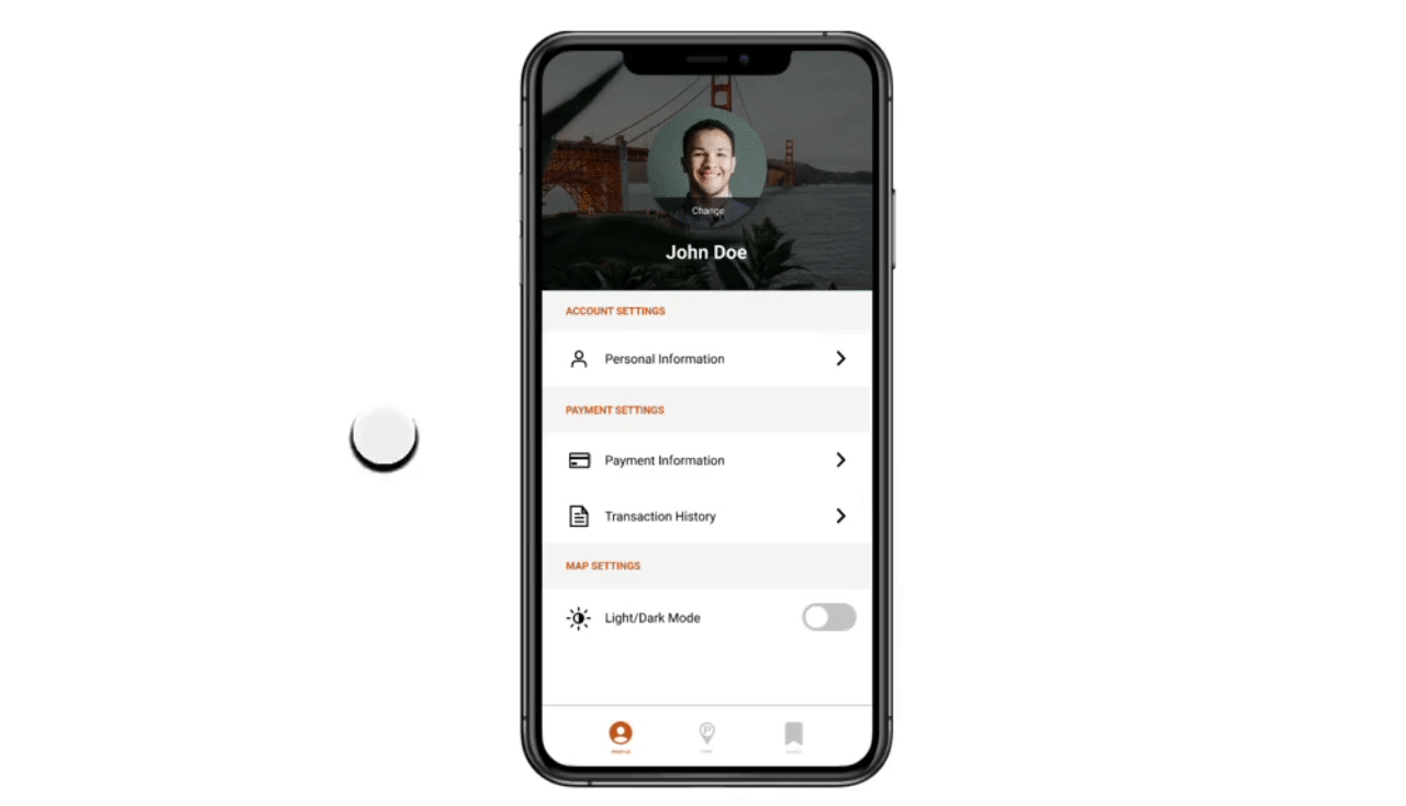
onboarding gif
Payment Settings
Entering their payment information allows for future integration of an in-app parking ticket payment system. Users can easily make purchases and keep track of their payment history.
payment settings gif
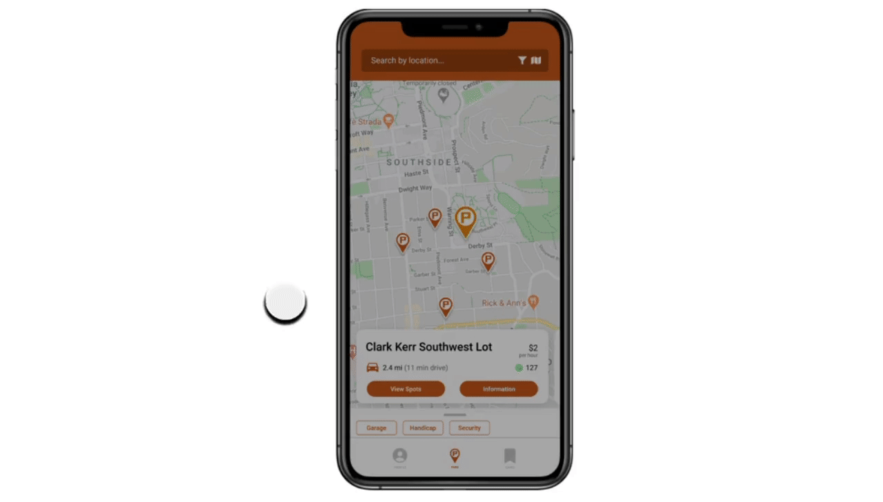
Location Search and Filter
Instead of first choosing from a list of all parking lots and garages compatible with JAPA, users can freely search for their destination. This new workflow and structure allows for easy scalability and gives more control to users.
search and filter gif
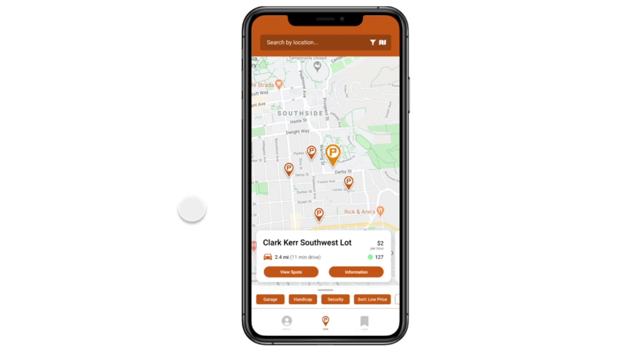
To further narrow the search, users can customize their preferences with the filter feature.
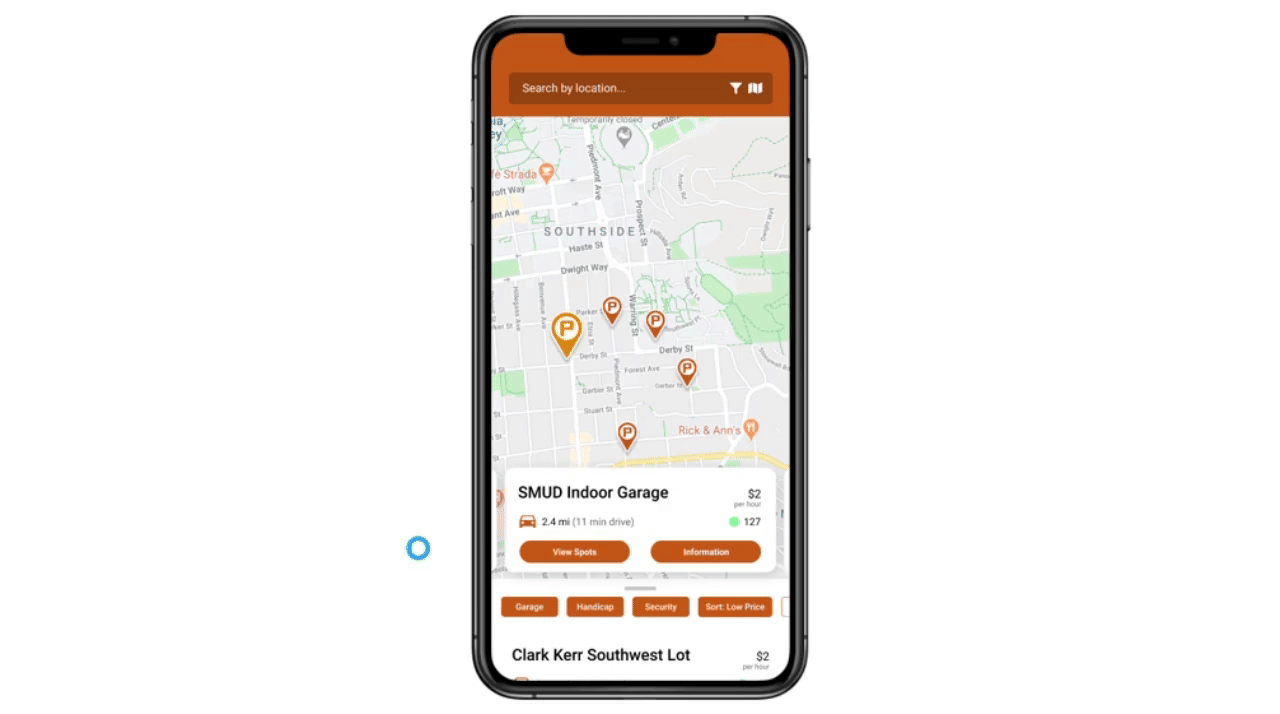
Quick Look to List View
Quick look serves to show users parking availability without having to click into a lot or garage for more information. List view serves to include users that may be short on time and want to see all the nearby lots at once.
quick look gif
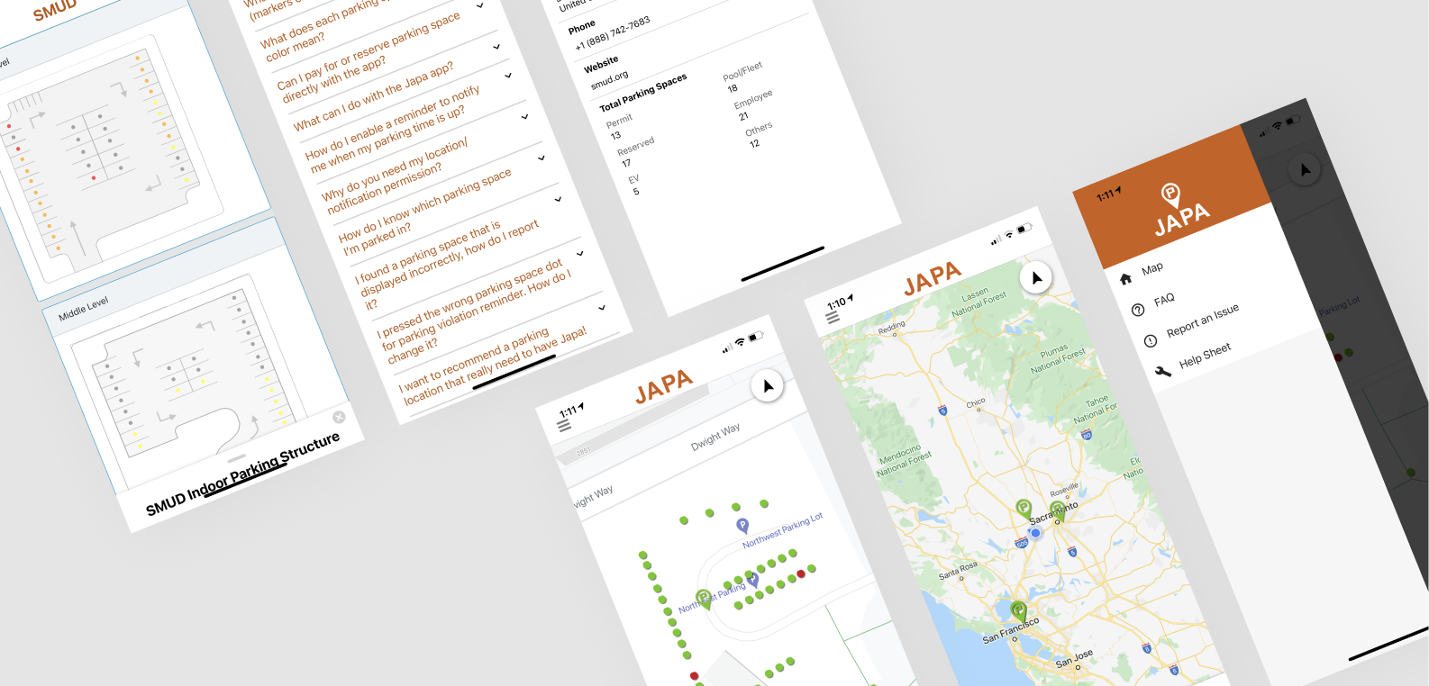
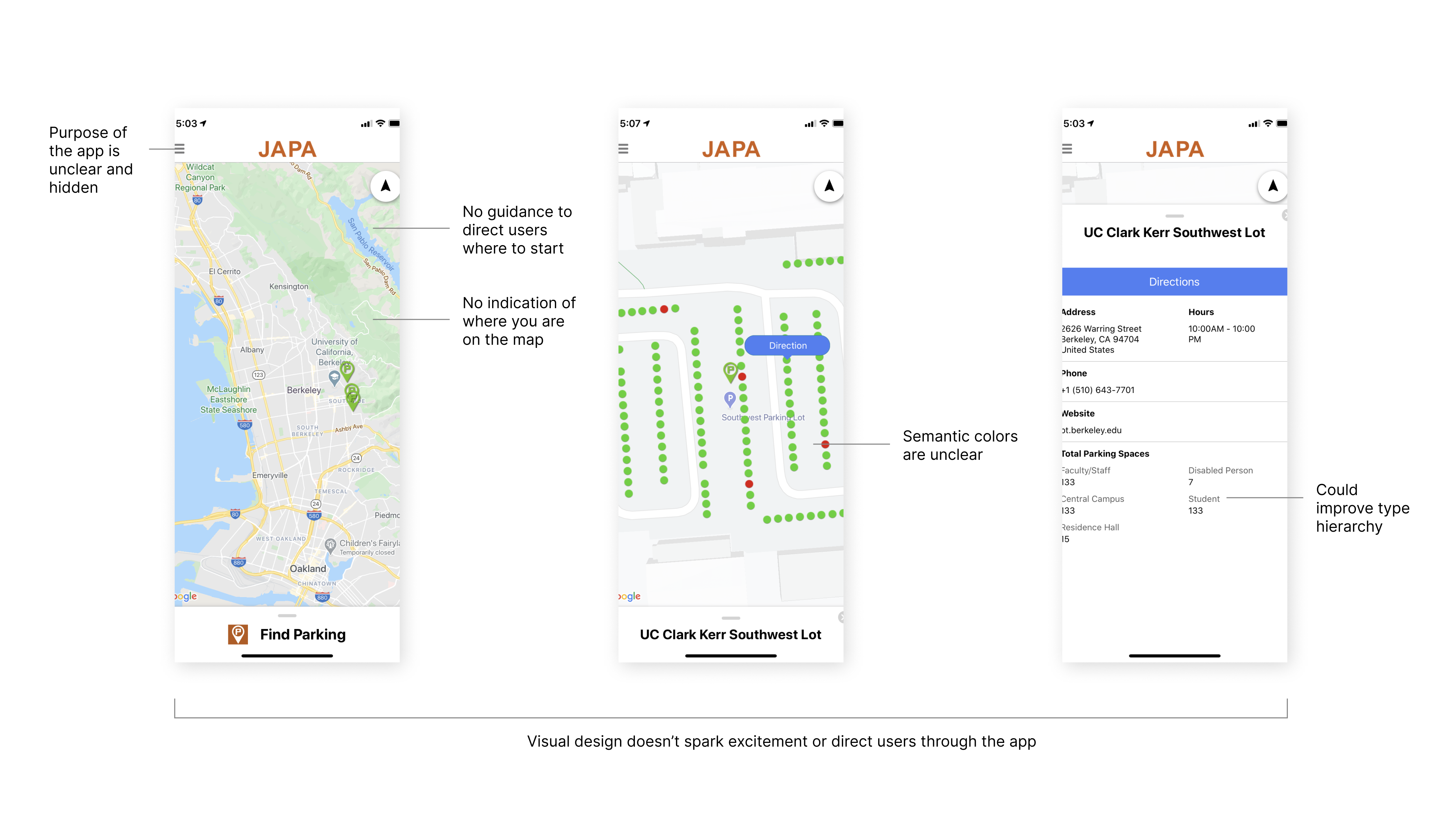
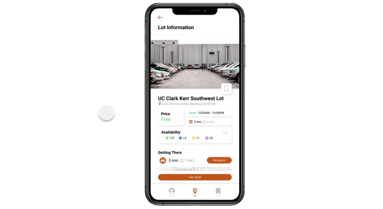
Parking Facility Information
The parking facility information page has been broken down into more digestible parts, optimized for quick eye scanning. Users can see pricing, hours, parking availability, directions, contact information, travel time, and any key information.
parking lot information gif
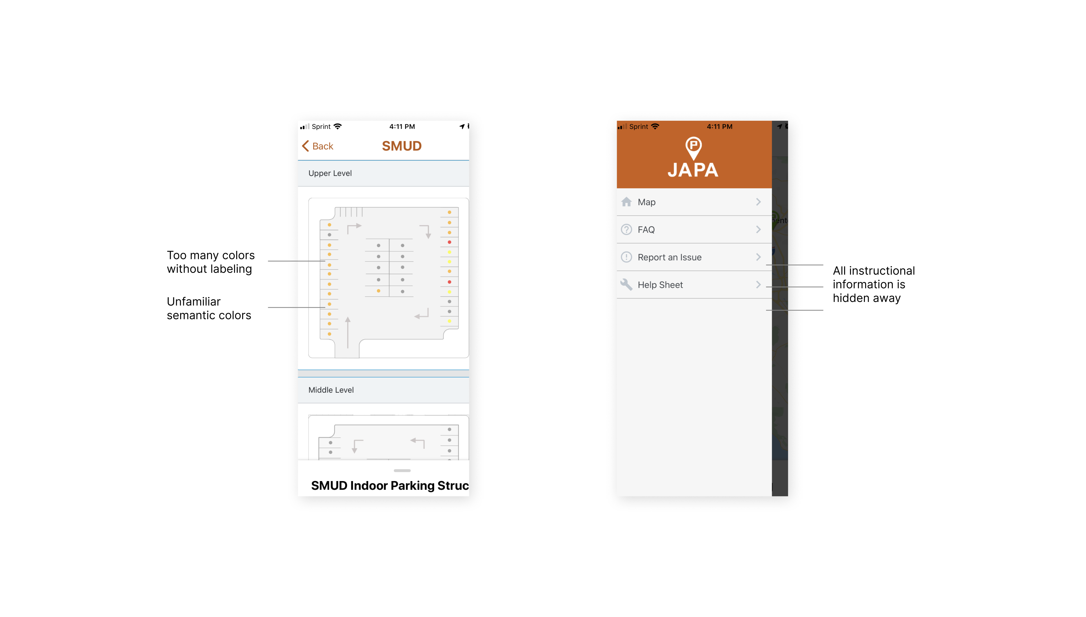
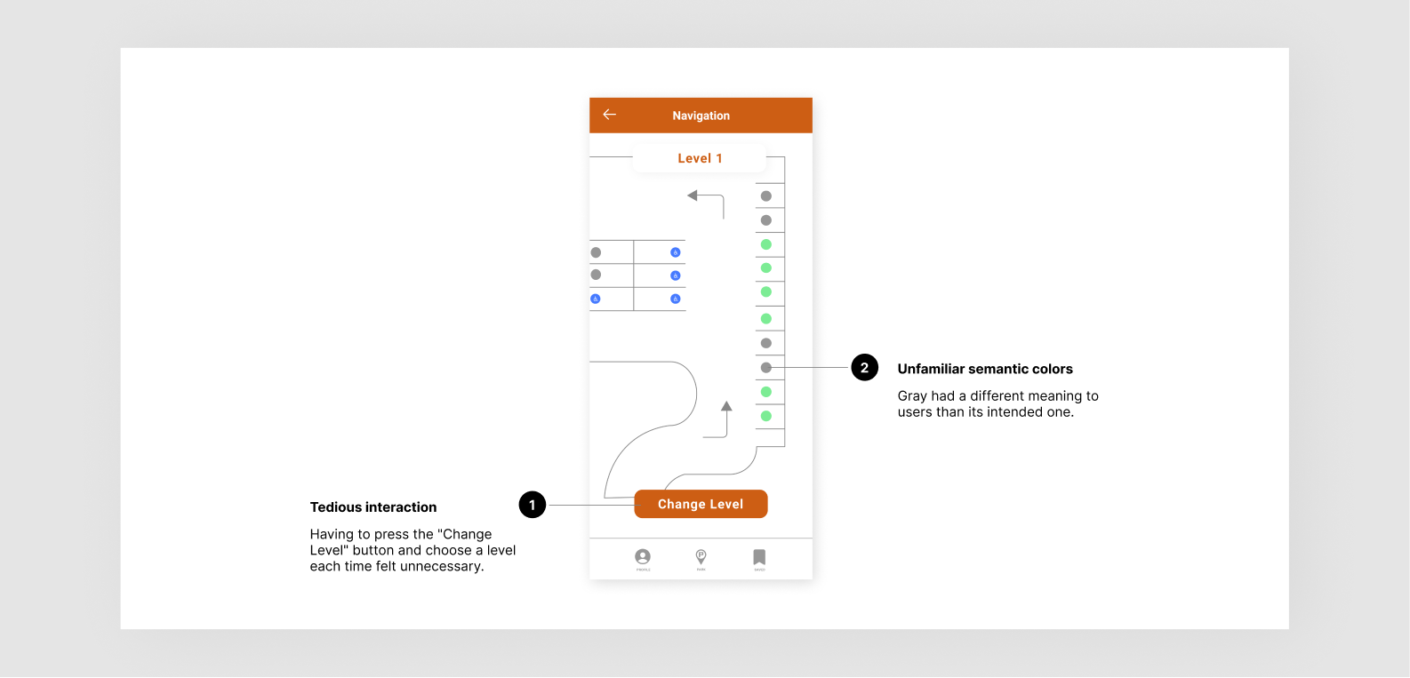
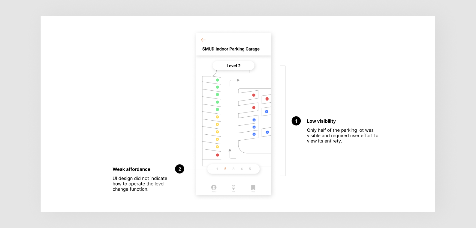
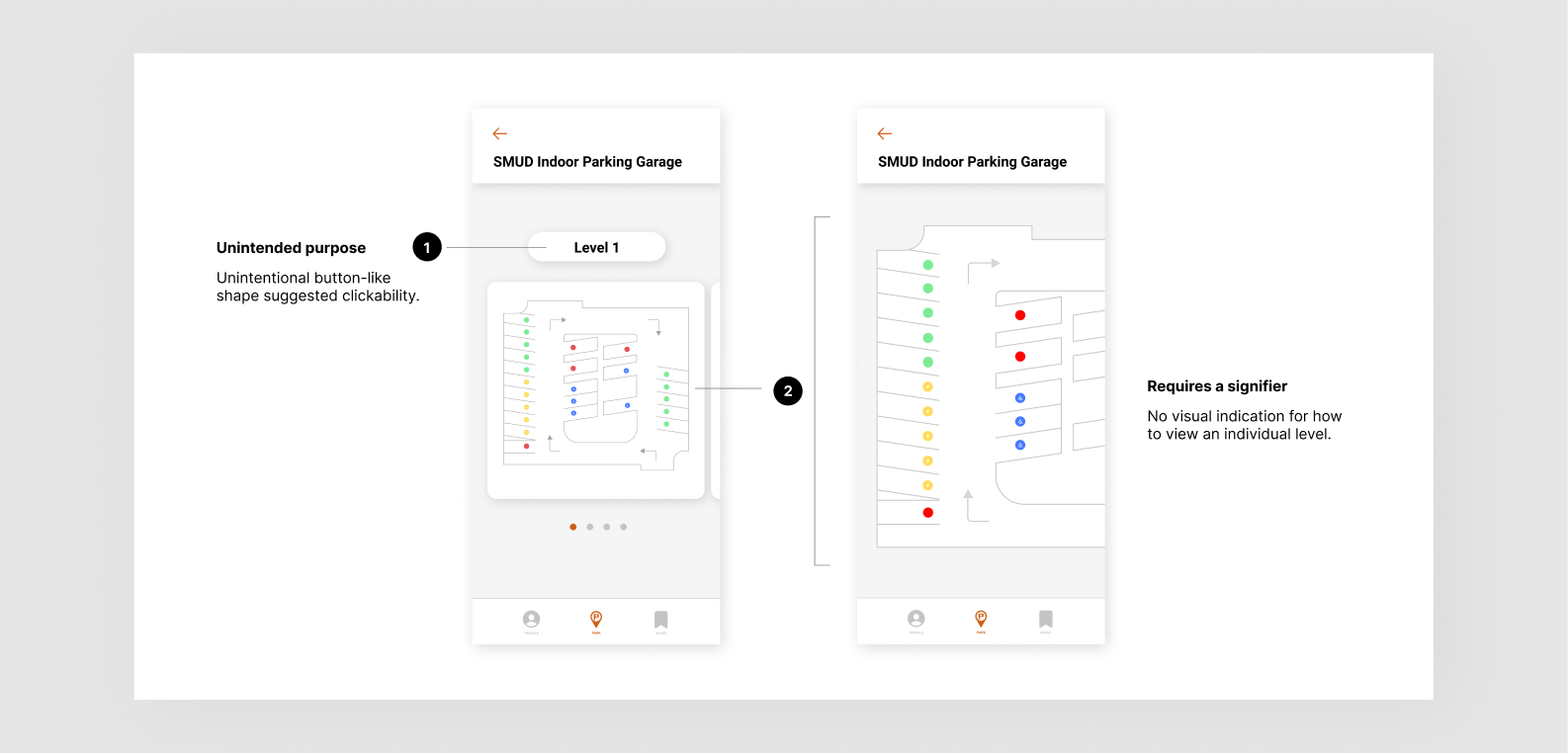
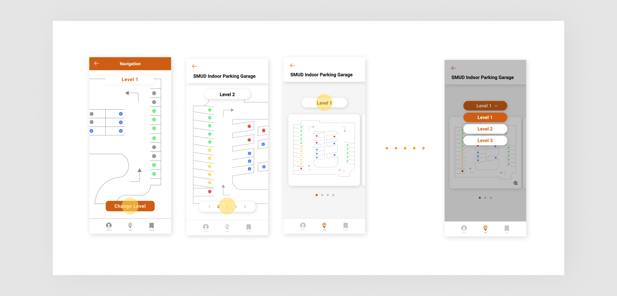
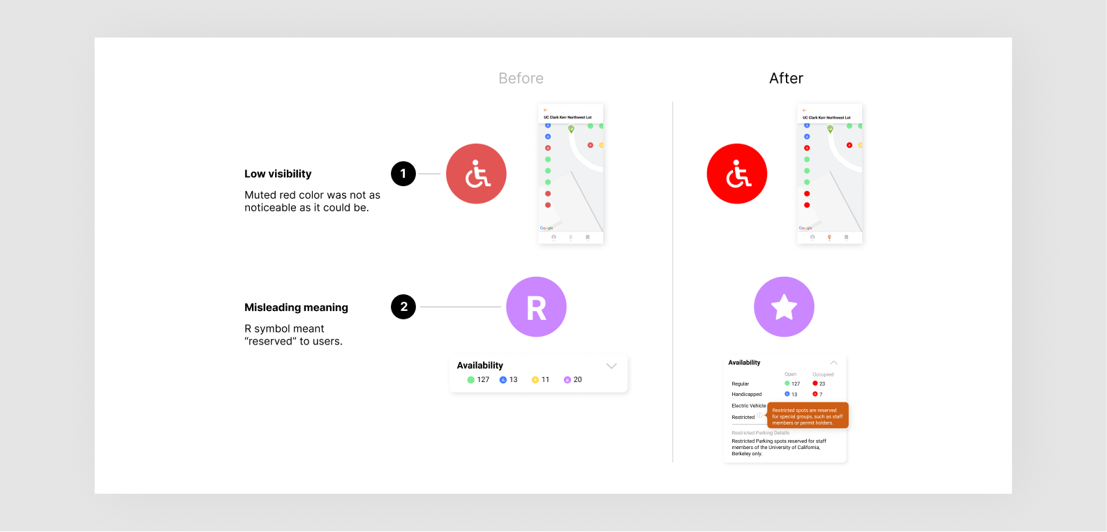
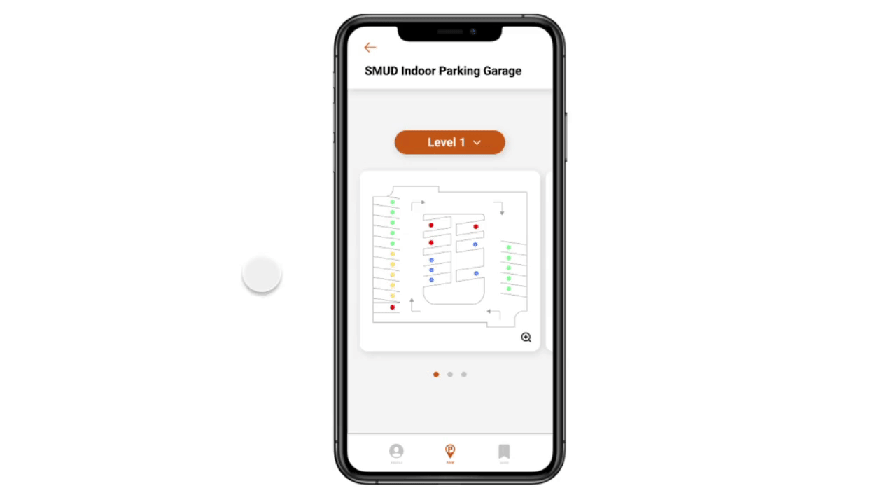
Parking Lot and Garage Layout
Once users have committed to a parking facility, the ability to check multiple levels is available. In the new parking layout, users can easily decide which level to park on based on the color coded parking spots. If a level is predominantly red, users can rule it out immediately.
garage layout gif
Driver Safety
Alerts users that they cannot use their phone while driving and all functions will be disabled until they've reached a stop. This will ensure that drivers avoid unsafe driving unless there is a passenger in the vehicle.
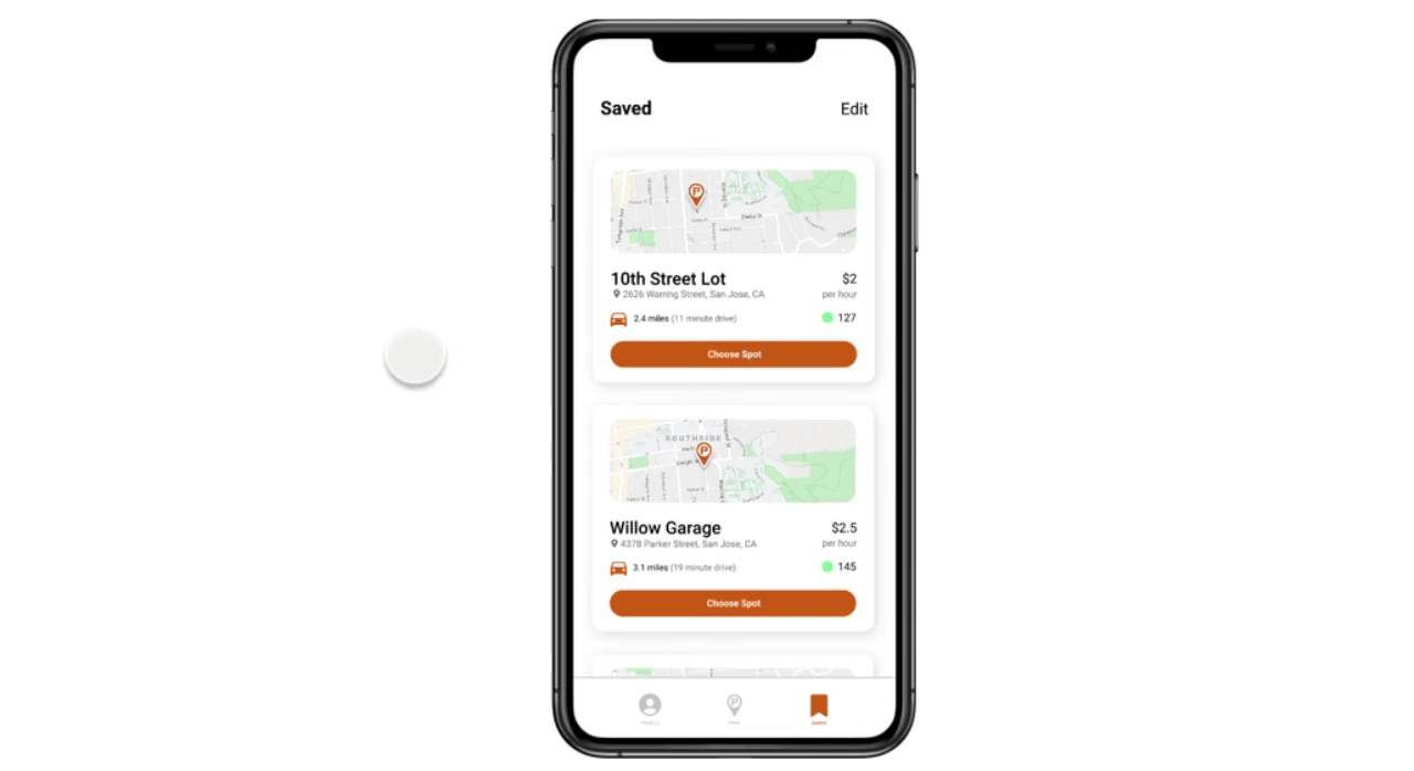
driver safety gif
Saved Lots
Users can save their frequented lots/garages to check parking availability quickly without having to search for the location. They can also delete any locations they no longer visit.
saved parking lots gif
final screens
My learnings (and many firsts!)
Working on a cross-functional team
This was my first time working with other designers as well as the CTO! It was really exciting for me because, I'll be honest, collaborating with people I don't already know is a challenge for me. It takes some time for me to get comfortable and be vulnerable sharing ideas and giving critiques. Even though it was challenging at first, it was so rewarding for me. I loved seeing our team dynamic evolve as time went on and getting more comfortable with each other. Working closely with JAPA's CTO was also a new and exciting experience! I've never had to present my work for non-designers and throughout this process, I learned how to present my designs in a way that was understandable to someone who wasn't directly involved in the process and support my design decisions with evidence.
Remote collaboration
Just like everyone else, this was my first time collaborating remotely. There's definitely something about physically working around other people that I miss, but this constraint offered a unique opportunity to learn how to work efficiently and effectively without the proper resources/materials. I learned how to conduct usability testing and interviews through Zoom (which is actually not as terrible as you'd think). I realized how important it is to document everything you're doing and explain concepts clearly to the users you're working with.
Advocating for the end-user
Like I mentioned, usability testing is the fun part and honestly, it really was. I loved iterating on the feedback users gave and I learned how important it is to always advocate for the end-user. It was humbling because I was reminded that my assumptions are definitely not always right and I'm not designing for myself, but for others.