2019
Conceptualizing the creative vision for a campus-wide orientation recruitment campaign
5 minute reading time
Project Details
My Role
Visual Designer, Brand Identity
Team
Myself
Duration
October – November 2019 (3 weeks)
Tools
Illustrator, Photoshop
Overview
Background
UC Davis Student Housing provides a home to over 10,000 UC Davis undergraduate and graduate students. About 6,000 students reside in the residence halls, most of them in their first year at the university. Student Housing's mission is to provide living, dining and academic support services that facilitate a successful transition to the UC Davis community and foster ongoing learning and life-skill development.
UC Davis Orientation is held to help first-year and transfer students prepare for a great first year. The experience is split into three parts: Aggie 101, Aggie Advising, and Aggie Orientation.
Objective 🔥
UC Davis Orientation hires over 600 student leaders in four different positions who make Aggie Orientation possible. This year's orientation experience implemented a new three-part system where each part had a corresponding color to differentiate itself from the others.

My role was to design the new hire marketing materials and branding for the upcoming 2020 orientation that incorporated this new standard. The goal was to get the word out about orientation leader recruitment and prompt students to apply.
Three-part system
The entire branding for this campaign was driven by the new three-part system and the colors that distinguished them. Each of the three parts is a step to guide students through orientation and is color-coded to distinguish them between each other.
Aggie 101
Aggie 101 is the first step in the UC Davis orientation experience! Aggie 101 is an online experience and by completing this step, students will:
• Be introduced to resources for their academic, personal, and social growth
• Know resources that can help meet theiry basic needs at UC Davis
• Understand the academic policies, requirements, and tools necessary for academic planning
• Identify ways they can build their community on campus
Aggie Advising
The second part of the orientation experience! Aggie Advising provides students with the academic advising support they need to prepare for course schedule planning and registration. By completing Aggie Advising, students will be able to:
• Effectively plan and register for a full Fall quarter schedule
• Register for a schedule that is appropriate for the Fall quarter
• Understand how to access academic advising
• Be aware of their academic advisor's role in supporting their success
• Be knowledgeable about department/college specific resources and strategies for success
Aggie Orientation
And last, but not least, the final step in the orientation process, Aggie Orientation. During this step, students will:
• Begin to build support networks with fellow Aggies that include new and current students, faculty, and staff.
• Become familiar with navigating our expansive campus to access relevant people and resources.
• Experience first-hand the academic rigors of UC Davis with the guidance of faculty.
• Be welcomed by college and major advisors essential to their academic success.
• Discover how they can contribute to our diverse community.
Integrating the color codes
Right now, UC Davis' main color palette emphasizes the UC Davis blue and gold. And the years prior to this orientation reflected this traditional UC Davis look and feel. With the introduction of these 3 new secondary colors (green, black, and tahoe blue), I was challenged to integrate them into the branding while still maintaining that UC Davis style.
Email header
I started out with desiging some email headers. Starting small helped me think about which of these brand identities would be suitable for the entire campaign, keeping in mind style and color constraints. For each of these iterations, I wanted the branding to communicate professionalism with a hint of playfulness to excite and encourage students to apply to become orientation leaders.
These are 3 email headers that I designed and sent for review. I was given a lot of freedom with these designs, however, it was crucial that I utilize the three colors for each part of orientation. We ultimately decided to move forward with the third design as it best matched the UC Davis branding style and placed emphasis on the 3 colors.
first iteration header
second iteration header
third iteration header
Building the brand identity
With a solid vision for the entire campaign, I went ahead and created a multitude of assets to be used in digital communications, in public spaces, and on social media.
LCD Screens
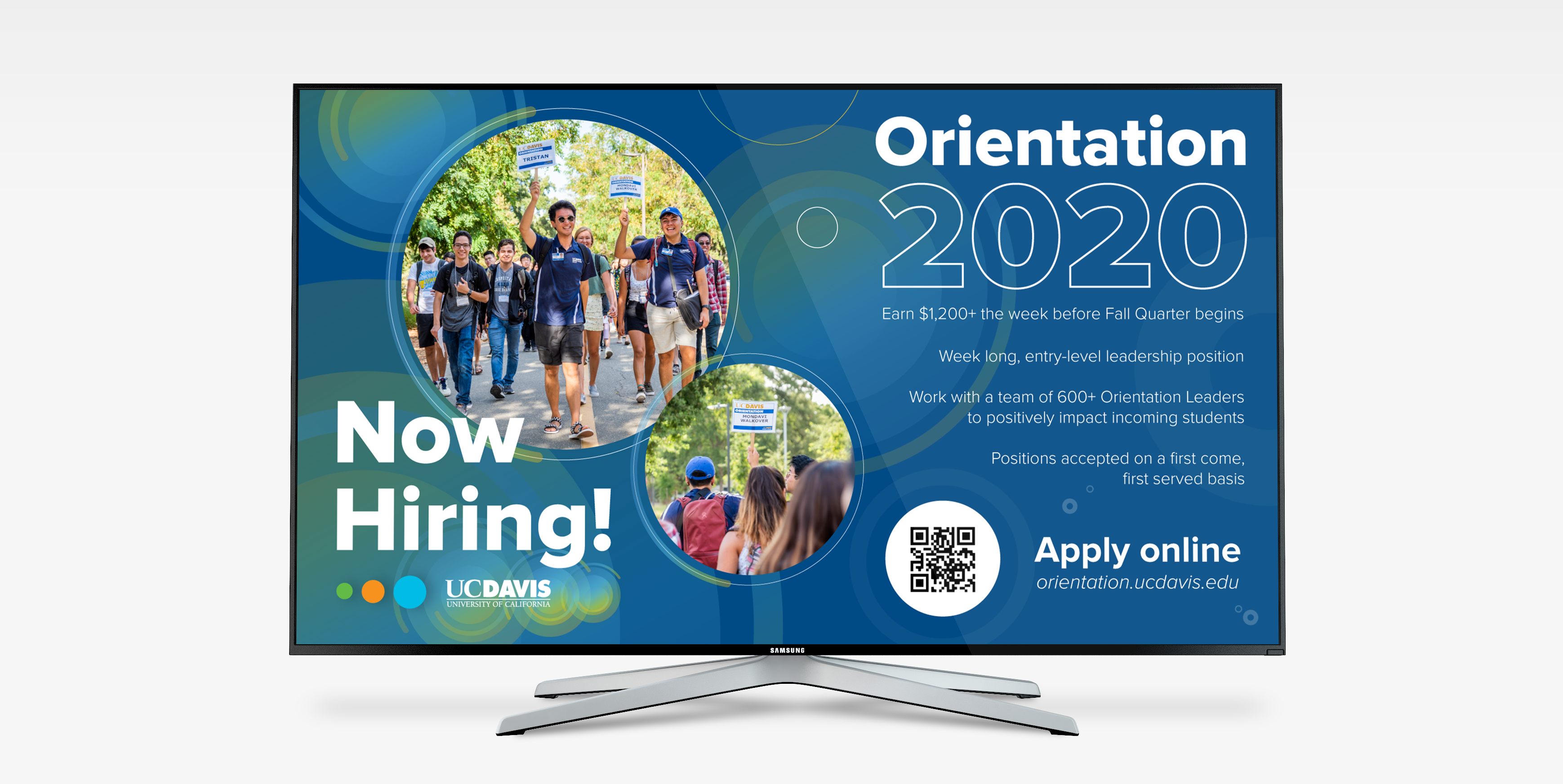
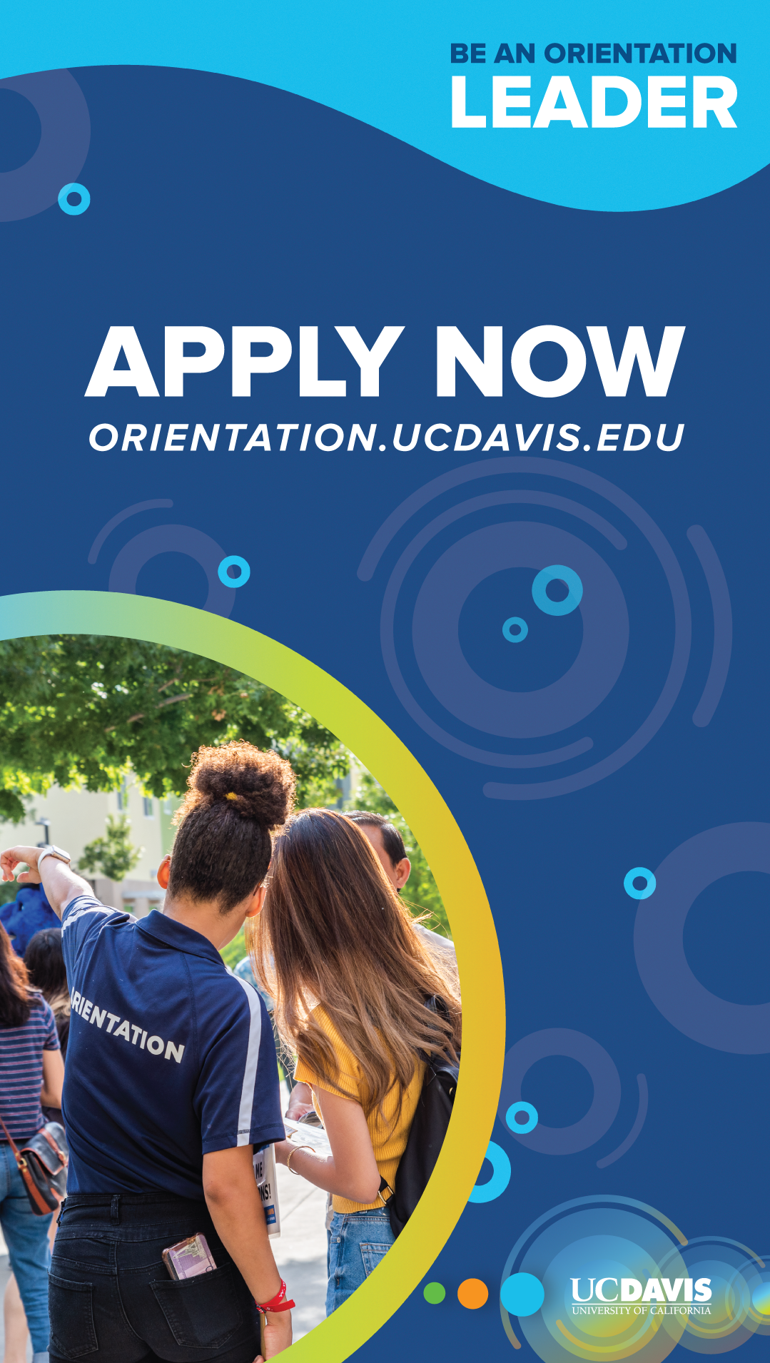
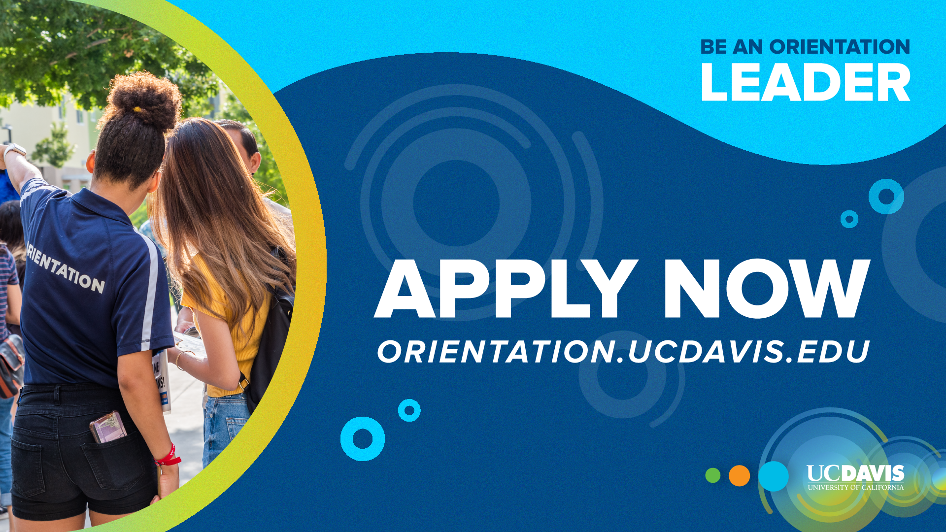
LCD screens are found all over the UC Davis campus, specifically in very popular, common areas with a lot of student traffic. I included a QR code to these assets for easy accessibility for students interested in being orientation leaders.
orientation lcd screen
Lanyards
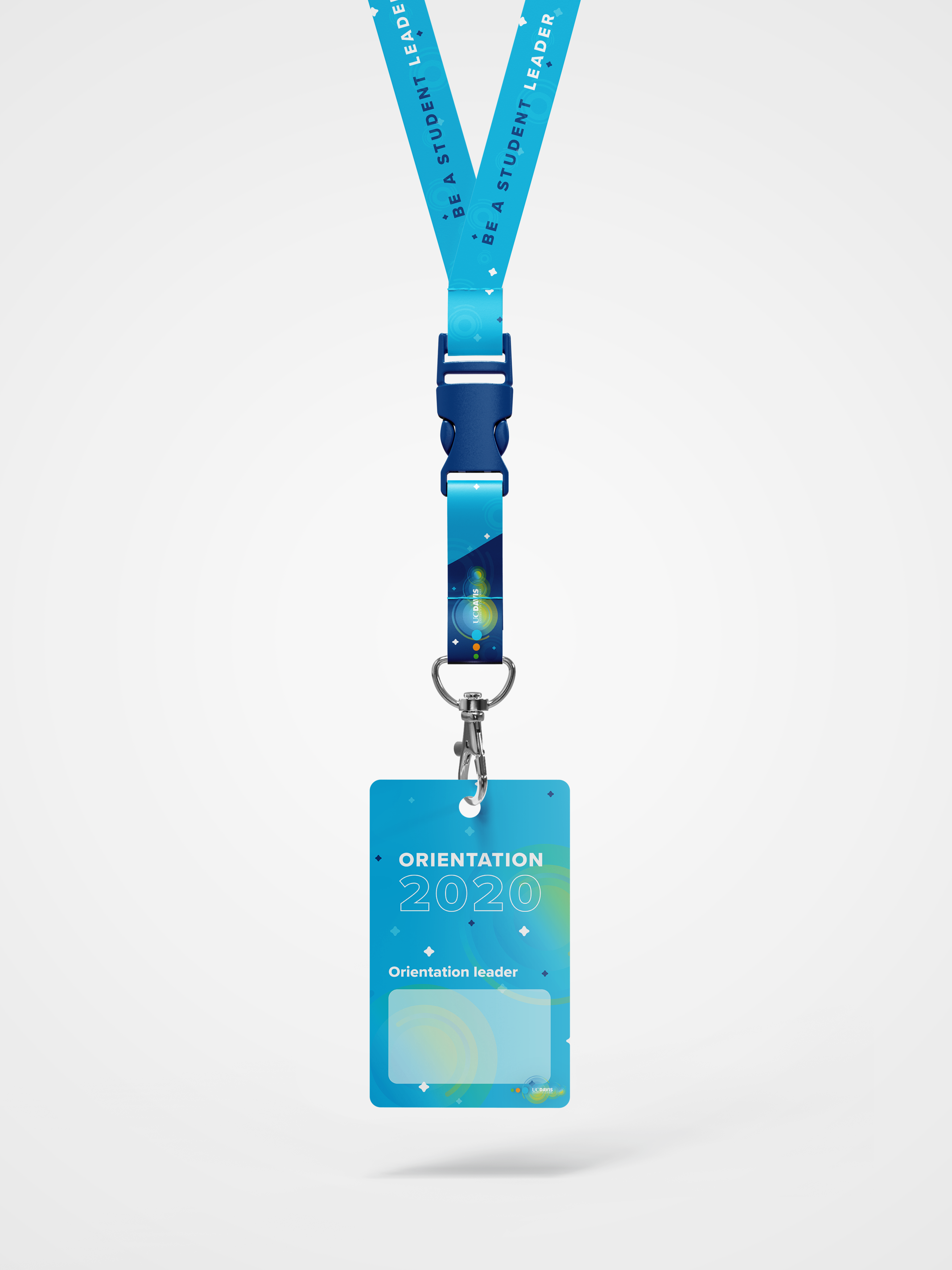
I designed these customizable lanyards to be given to all orientation leaders during the event.
orientation lanyard
Free tshirts!
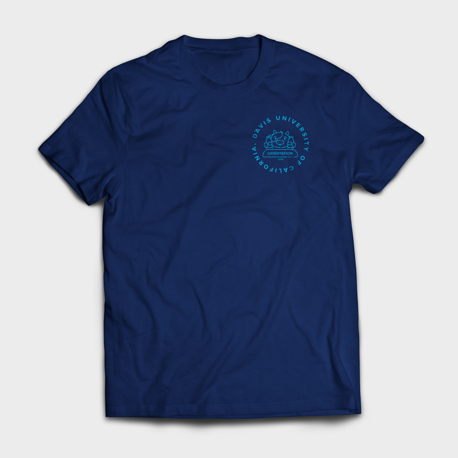
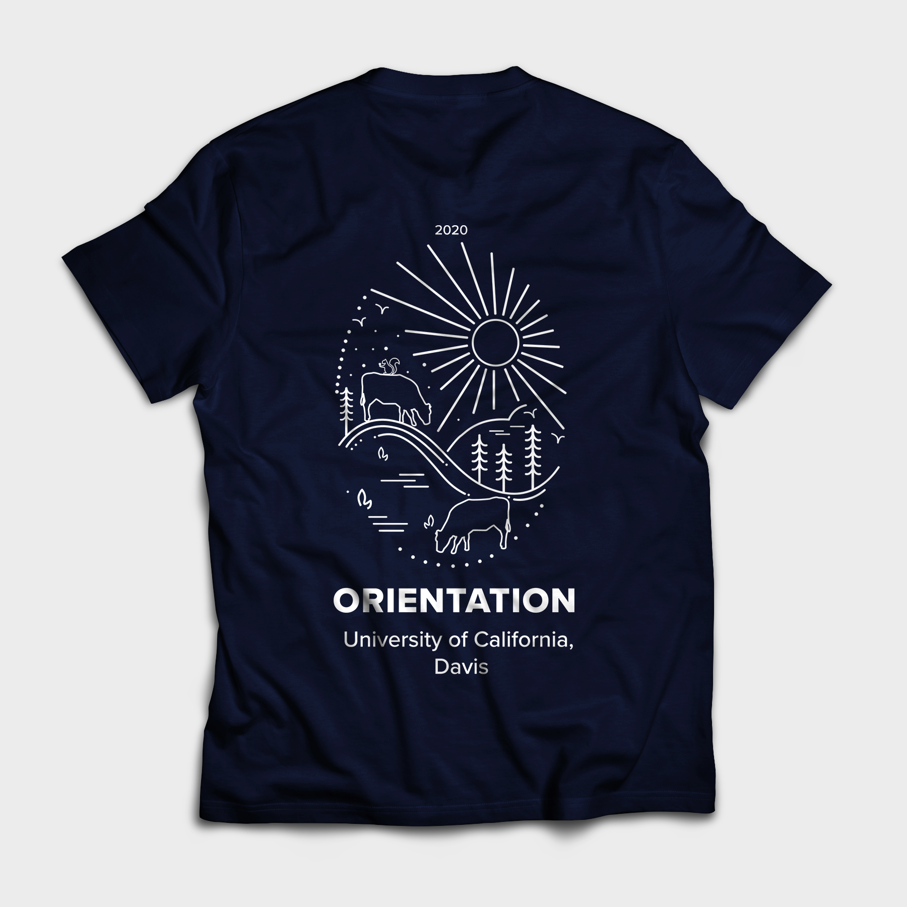
UC Davis is known for giving out tons of free merchandise to attendees during orientation as well as to orientation leaders. I designed two different shirt designs for attendees and leaders to show off during the event.
orientation shirt 1 orientation shirt 2
Stickers and buttons
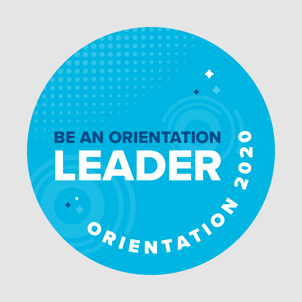
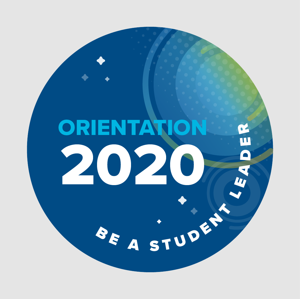
Stickers and buttons are also popular commodities on campus and an easy way to grow awareness for our recruiting campaign. I designed two versions to communicate the excitement and importance of this leadership opportunity.
orientation sticker 1 orientation sticker 2
Campaign launch
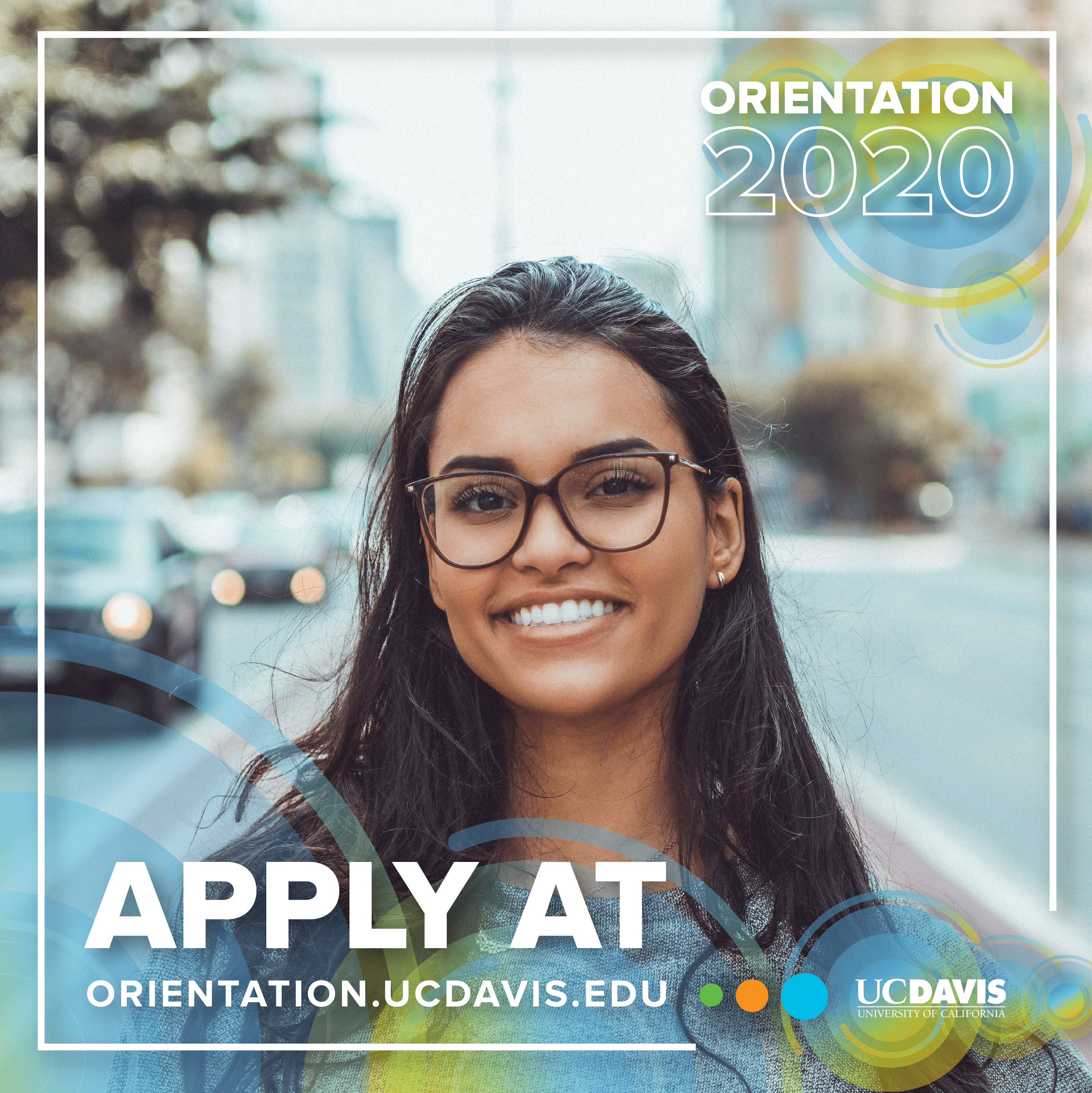
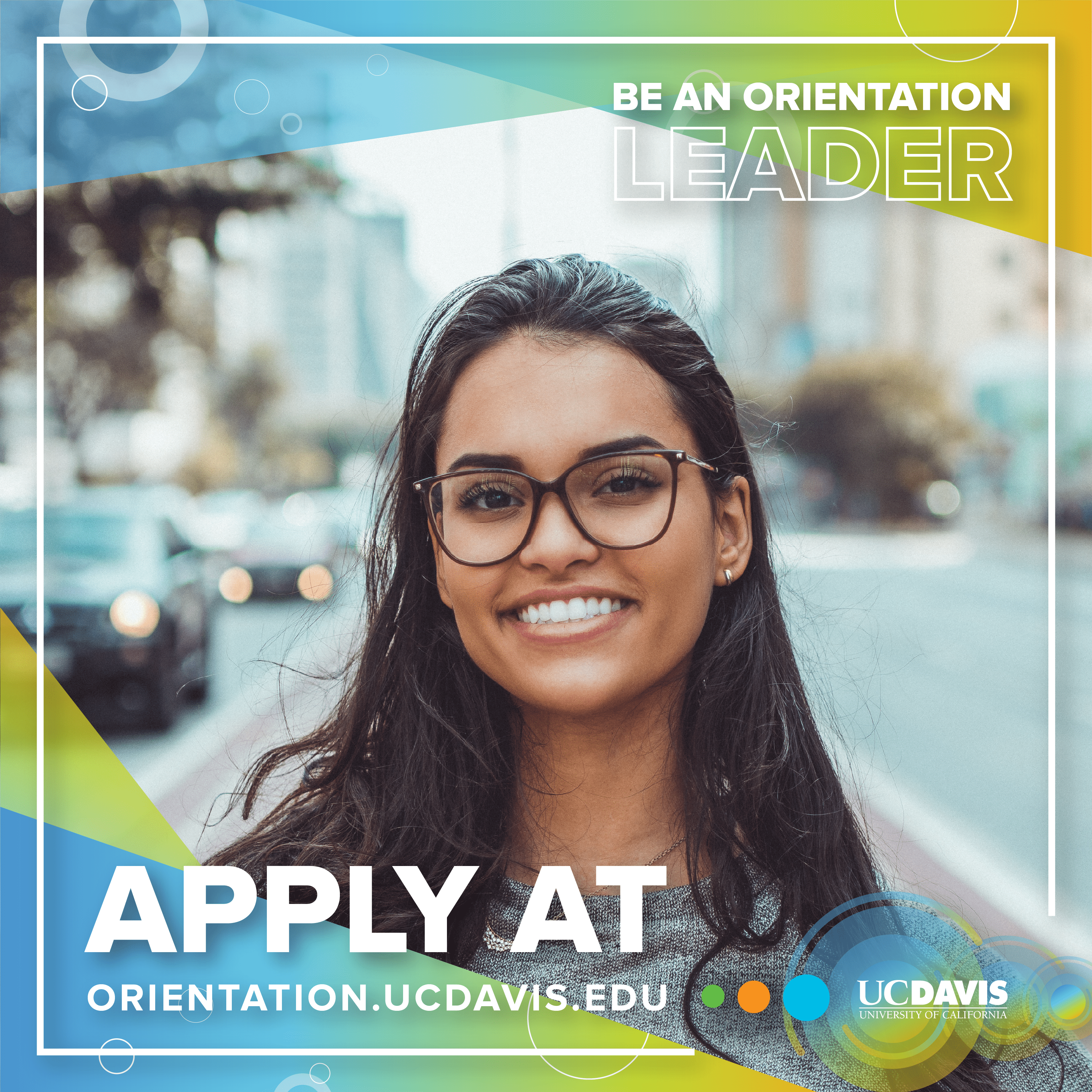
UC Davis Student Housing utilizes their social media handles (i.e. Facebook, Instagram, etc.) to advertise for events and promotions. I designed these Facebook frames for current orientation leaders to post to reach a broader student audience.
facebook frame 1 facebook frame 2
Instagram assets
Because most students are more active on Instagram, our Social Media Coordinator had me create assets for our Instagram to increase visibility of the campaign.
facebook cover
facebook cover
My learnings
Happy medium
Despite not being able to see all of these designs come to surface due to the pandemic, I really enjoyed creating this vision for the brand identity. Because I work at UC Davis Student Housing, my work must be approved by many important campus professionals and trying to maintain the UC Davis branding without sacrificing my creativity and design style has posed a challenge for me. However, I've been able to design for much larger audiences and explore ways of creating a happy medium between maintaining the university's image as well as my own style. It's still in progress, but through doing this kind of work, I've learned to design more unselfishly and think about how others will perceive and experience my work rather than just myself.