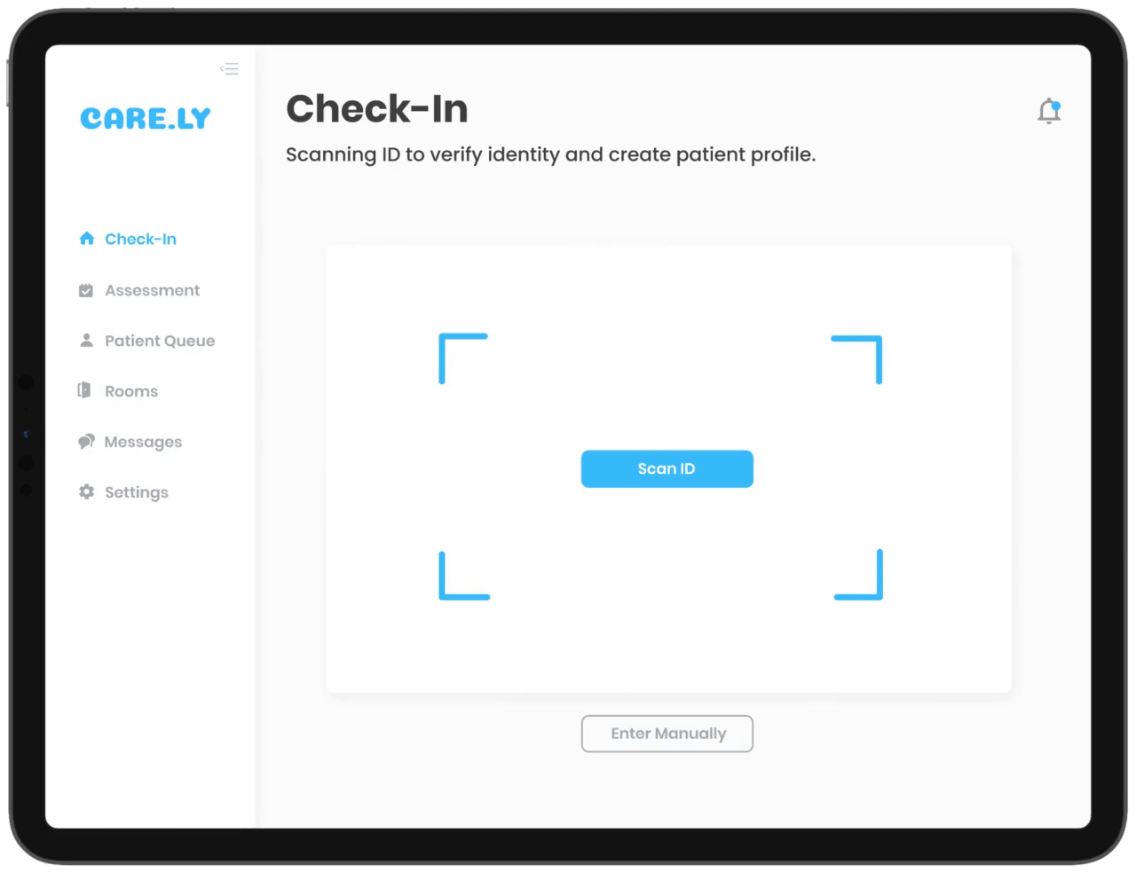
Resume Playground ↗ About Home
← Go Back
2020, Remote
Making more time for patients, spending less on paperwork.
Project Details
My Role
UX Researcher, UI/UX Designer
Team
Designers: Myself, Aisleen Santos
Duration
May 2020 (36 hours)
Tools
Figma, Google Docs
Participating in a hackathon!
This year we participated in the 2020 DubsTech Protothon, an online UX hackathon held by the University of Washington (UW). From the 3 project tracks to choose from, we decided to tackle the health track to design a digital product that helped alleviate the burden on healthcare workers during this pandemic.
Overall, this was a very collaborative and exploratory process, despite the strict time constraints. By the end of the weekend, we submitted an interactive prototype for judging.
We actually revisited this project after the hackathon because we wanted to do more testing to validate our product as well as discover any new needs or behaviors our users had.
Overview
The Prompt
Design a mobile or tablet (preferred) application that allows nurses to seamlessly check-in new patients and communicate with patients, care providers, and rooms so there’s more time for patients and less paperwork.
The Solution 🔥
We spent the weekend conducting secondary research around our problem space, iterating on ideas, and using our findings to design Care.ly, a tablet application that helps health care providers tackling COVID-19, seamlessly check in new patients, spend less time on paperwork, and decrease treatment wait times.
final solution mockups
Solution Demos
Scan ID to check in
The scan ID check in function quickly identifies the patient's information and matches it to their patient medical records on EMR.
This eliminates the need for manual patient data entry.
home feed gif
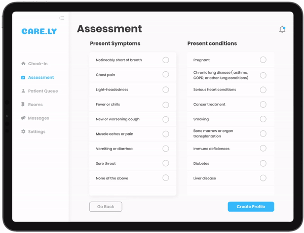
Symptoms and illnesses assessment
To complete the patient's profile and registration, the nurse is prompted to identify and select the patient’s current symptoms and any underlying illnesses they have.
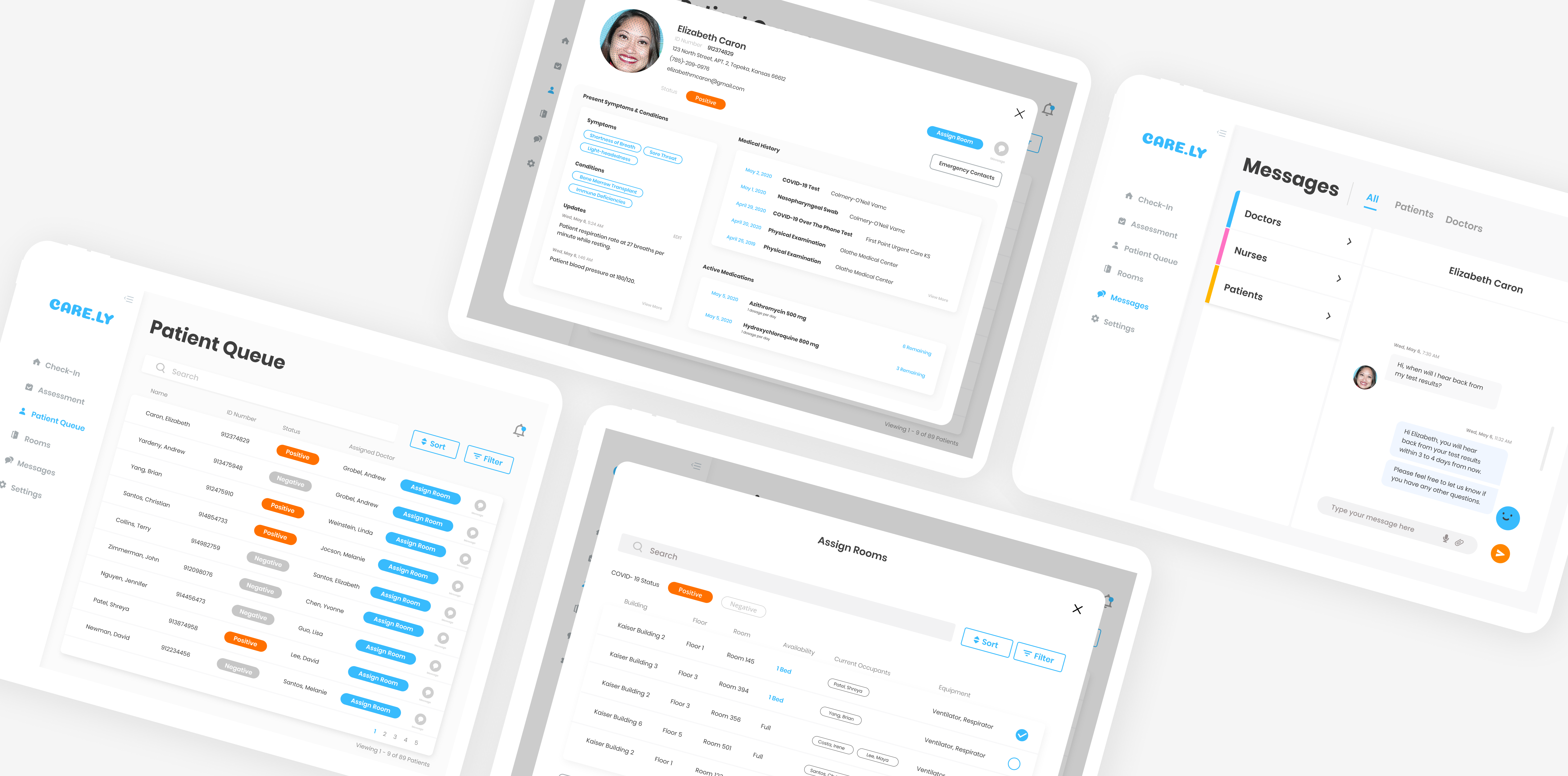
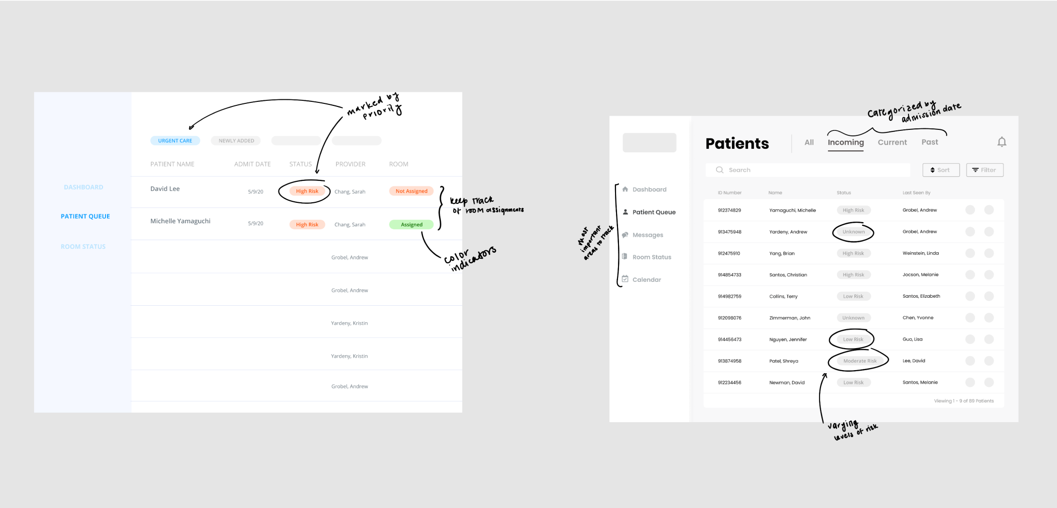
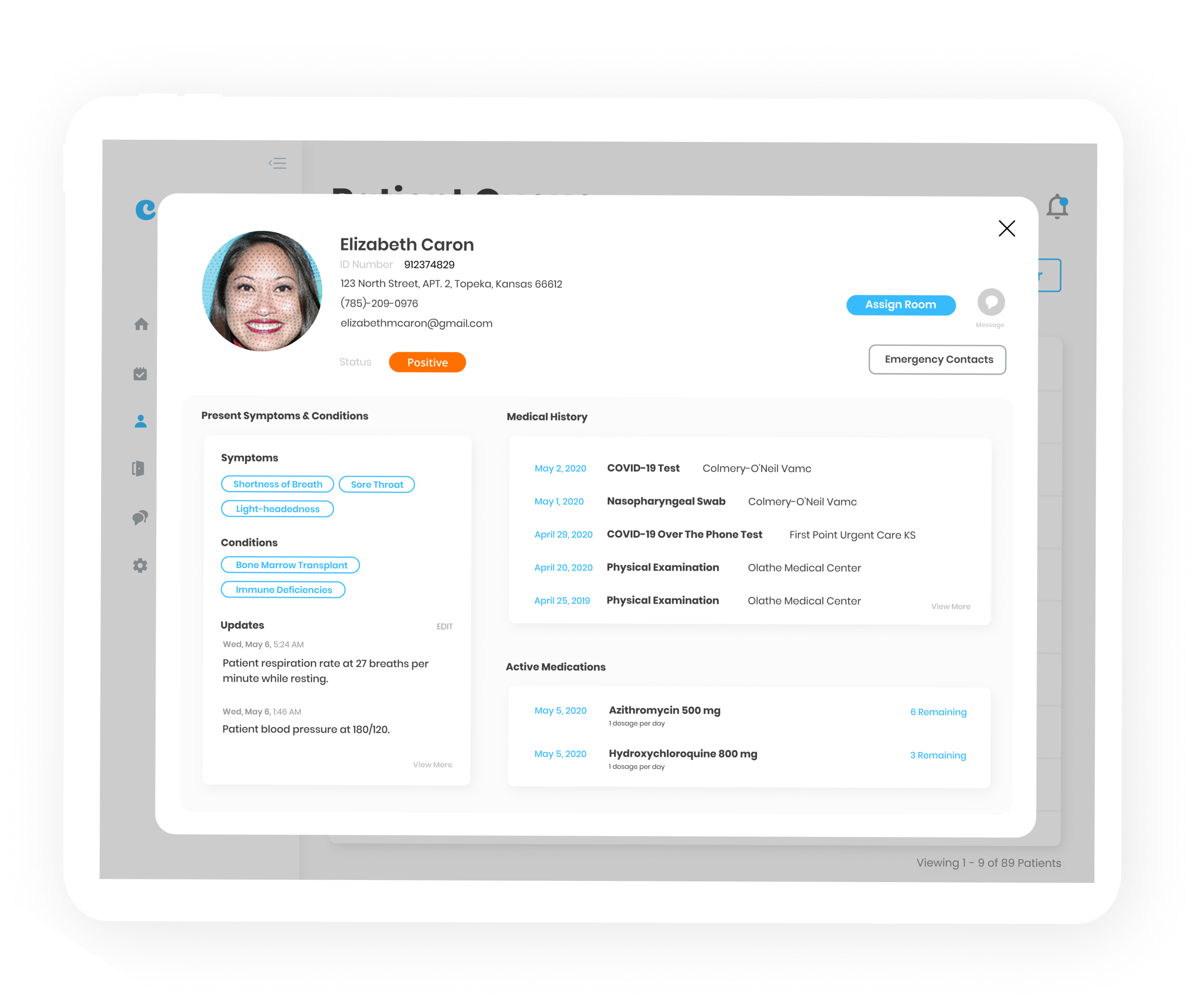
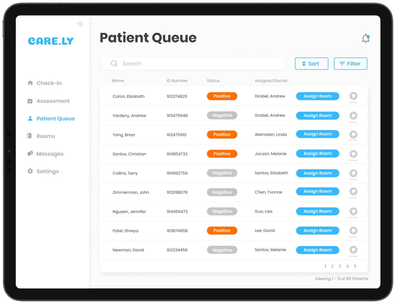
symptoms and illness assessment gif
Patient profile
Nurses and doctors can easily access a patient's medical history from EMR. This page allows them to see their COVID-19 status, personal information, symptoms and illnesses, active medications, and medical history.
All of the patient's information can be found here, keeping nurses and doctors from digging through piles of paperwork.
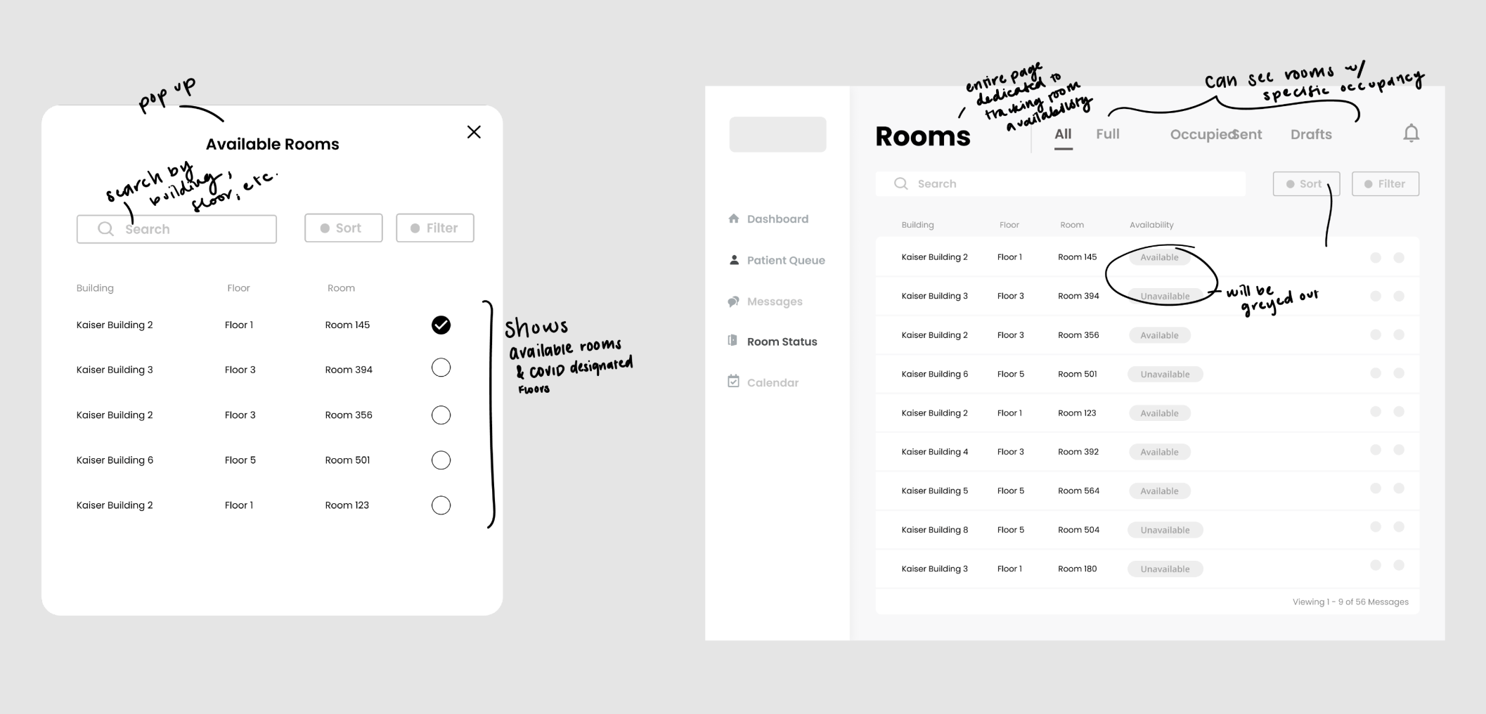
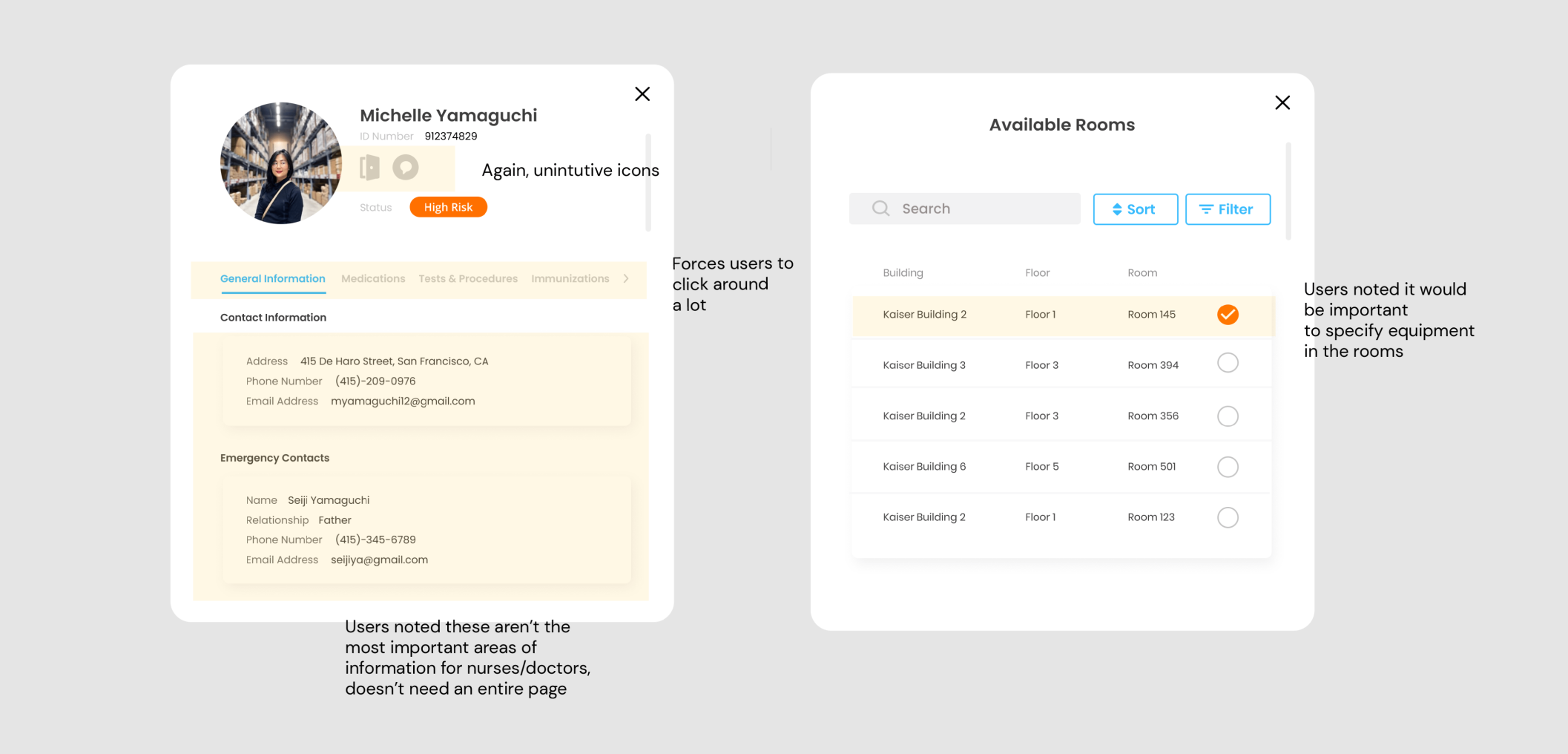
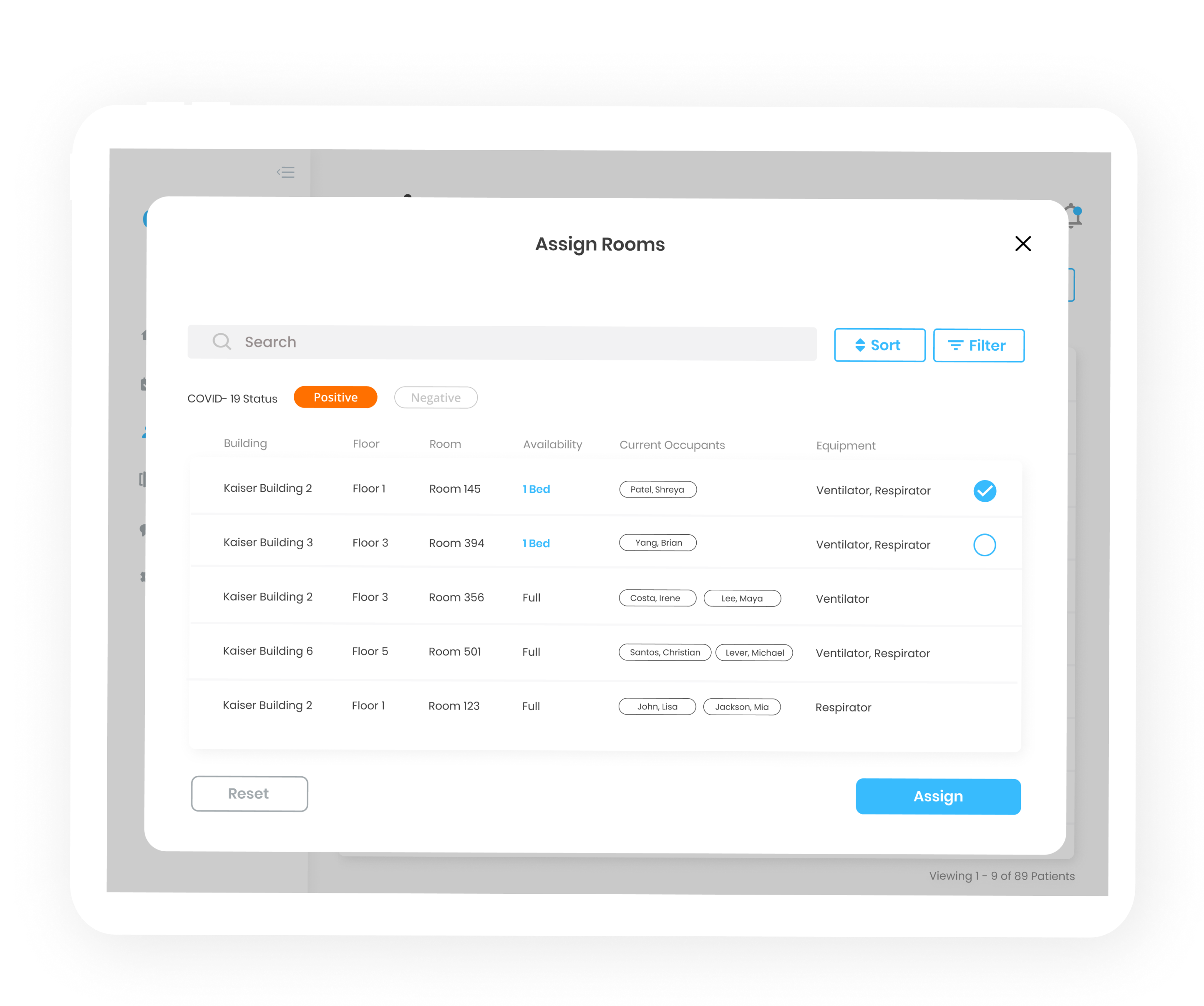
patient profile gif
Room assignments
When it's time for a patient to be assigned to a room, the nurse is shown the floors designated for the appropriate COVID results. In this case, the patient is COVID positive, thus the floors displayed are designated for patients with COVID. They can also see what rooms are available, the equipment present, and current occupants.
room assignment gif
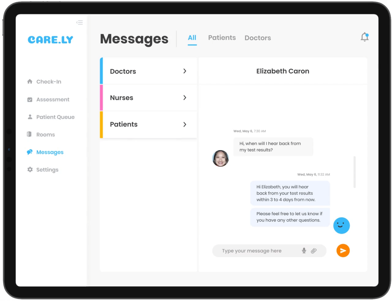
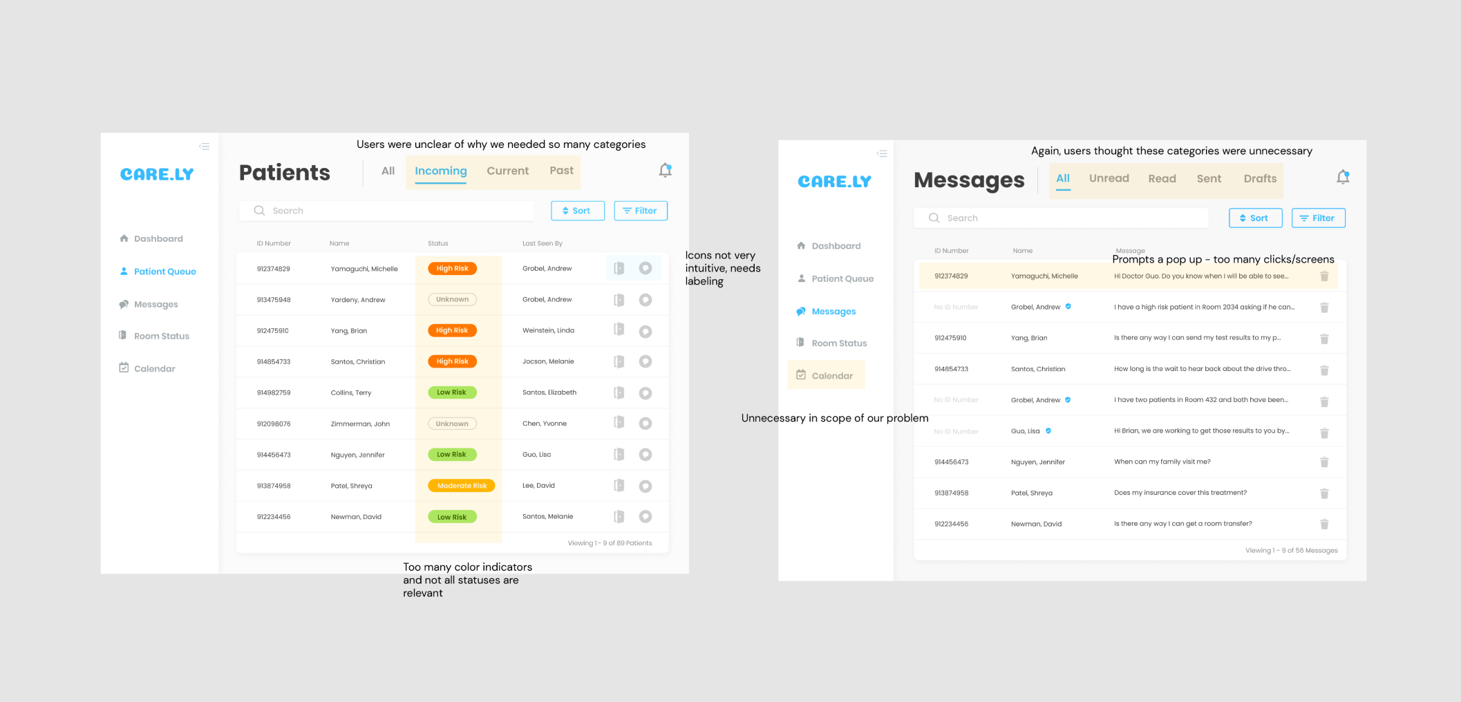
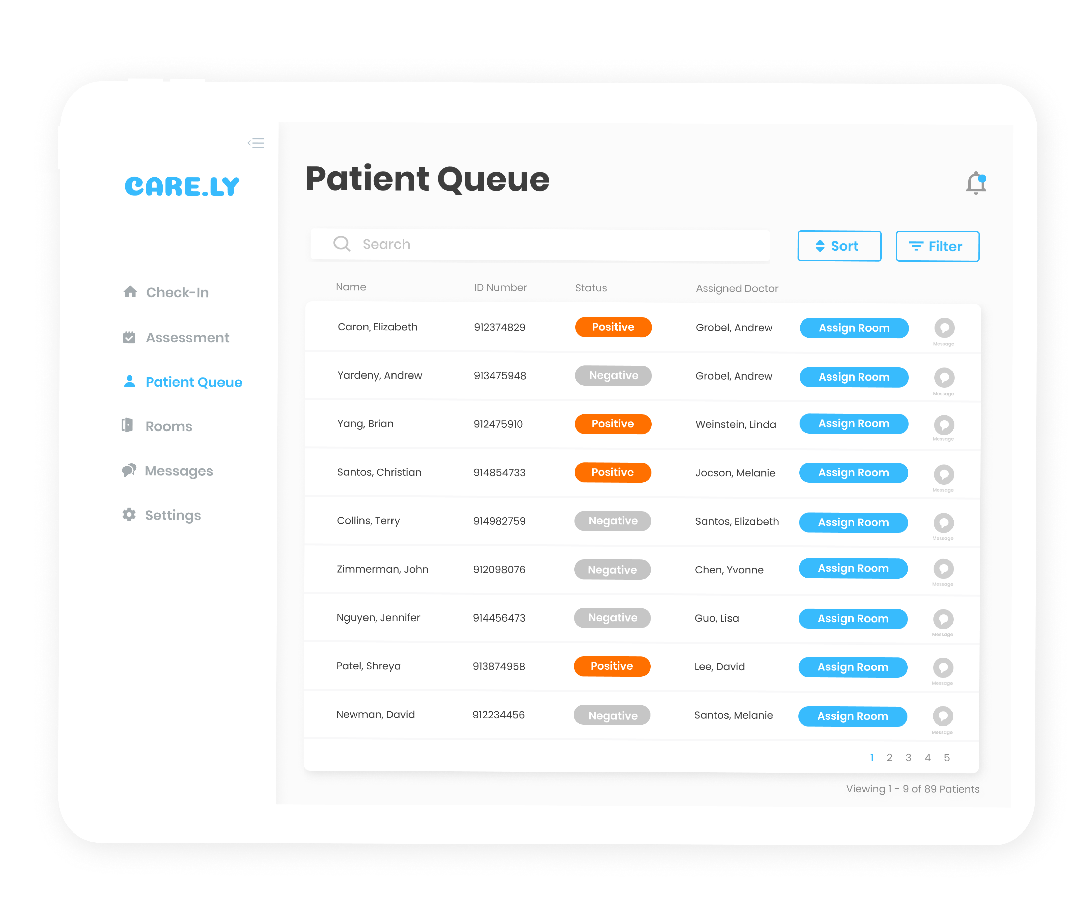
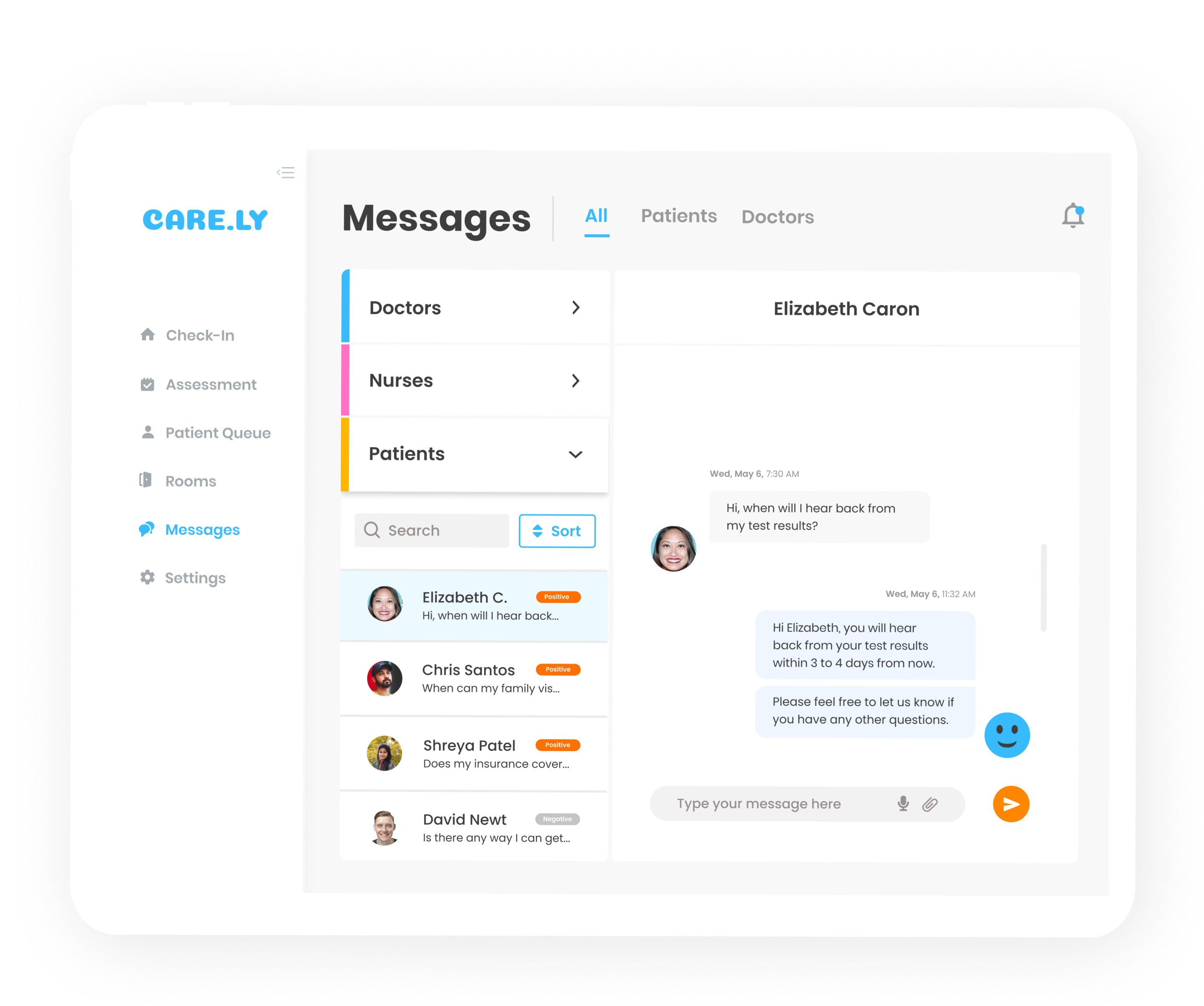
Message doctors, nurses, and patients
Doctors and nurses can easily communicate between each other and their patients. This quickens communication especially for any emergencies or important updates.
messages gif
UX Research Plan
Given our time constraint and the limited availability of healthcare workers, we relied on secondary research to understand our problem space. We conducted a thorough literature review by consulting journals published by the CDC, reports from the U.S. Department of Health and Human Services, and videos of what the current system looks like.
Literature review
After reading a handful of journals and reports, we were able to learn about what the current state of our hospital care system was like.
With the novel coronavirus pandemic, hospitals are facing a rapid influx of patients coming in to be identified, isolated, tested, or admitted for COVID-19. This has led cities and hospitals to create external testing setups and temporary hospital-like camps to accommodate for this massive influx of patients.
Due to this overflow, front-line workers (doctors, nurses, assistants, etc.), are inevitably spending more time on paperwork which is costing them an unnecessary amount of time and hindering them from providing enough care to their patients.
Main issues
We wanted to specify what the main problems were within this umbrella problem space so that we could turn our insights into actionable ideas.
1. Hospitals are segregated by COVID and non-COVID floors.
2. Communication is mainly done through phone calls.
3. Hospitals reported that severe shortages of testing supplies and extended waits for test results limited hospitals' ability to monitor the health of patients and staff.
4. Hospital administrators expressed concerns that fear and uncertainty were taking an emotional toll on staff, both professionally and personally.
Putting a face to our insights
From our research, we identified the most common concerns and goals doctors and nurses had. We noticed immediately that there was overlap between goals and pain points for both, which led us to design our final product to fit both personas' needs and goals.
doctor persona image
nurse persona image
Asking questions
From there we started brainstorming more high-level research questions through How Might We's. how might we's image
Discovering Opportunities
Mapping out these How Might We's made space for opportunity. By pinpointing the overarching problems as specific categories, we were able to build off each other's ideas and got us thinking about what features might be the most useful.
affinity mapping solutions image
How might we design around fear and uncertainty?
We used a journey map to capture a lot of the sentiments outlined in our main insights. The current experience of checking in patients can be broken down into these 5 steps: arrival, check-in, online input, check room availability, and repeat. user journey map image
A lot of iterating
We went through tons of sketches and wireframes before arriving at anything in the high fidelity range.
iterations
iterations 2
iterations 3
What we ended up submitting
When those 36 hours were up, this is what we ended up submitting.
submitted project gif
Revisiting our project
We wanted to revisit this project and improve areas we weren't satisfied with when we submitted it.
We conducted usability testing to find out where we could make revisions. Here's what we found out:
1. Some icons were misleading
2. Users were presented with too much information
3. Too many color indicators
4. Too many screens to go through
Edits based on usability testing
We pointed our the areas where users had the most difficulty or confusion and used these insights to guide our revisions.
edits
edits2
So what did we change?
These are our final solutions that were driven by research, user feedback, and user testing.
Color indicators, statuses, and assign room button
We realized their were way too many colors that indicated different statuses that weren't exactly relevant. We determined that the most important ones to note were if a patient was COVID positive or negative. Based on those two statuses, nurses and doctors could keep track of their patients more easily because there weren't as many options to get distracted with.
As for the Assign Room button, we swapped out the original door icon for a simple text button. This direct labeling allows for more immediate understanding and clarity of its function. color indicators, status, and assign room changes
Patient profile
For the patient profile, we scrapped the original layout and displayed all relevant information on a single screen. Doctors and nurses can view and edit everything without having to click through multiple screens. patient profile changes
Messages
We wanted to limit the number of clicks nurses and doctors needed to make in order to complete a task, so we integrated the messaging pop up into the Messages page itself. messages changes
Equipment addition
Users expressed it would be helpful to know what equipment was present in the rooms so that nurses and doctors could assign patients based on the equipment necessary to treat their level of illness. equipment changes
My learnings
Designing for a real-world issue
Most of the projects I've worked on are focused more on augmenting social good, so this project gave me a small taste of what it meant to design for impact. This concept was something that was extremely relevant and because it was a real-world issue, I felt more inclined to think deeply about the stakeholders involved and how this product could improve their current system.
Designing for experiences I've never related to
I loved being able to think through this problem because its something I have never related to. It was a challenge because I couldn't refer to my own experience or people in my immediate network, but it made this project all the more exciting. I enjoyed thinking through this tough problem in such a short time and its made me realize how important it is to talk to those who are involved. The research done during this project was all secondary and I definitely wish I could've talked to a real person directly involved. That would have provided much richer insights and helped me understand the goals and needs more holistically.